Project 2 Insights on Worldbank Data

Author: Jiaying Chen
Recall the gapminder data frame from the gapminder package.
- Life expectancy at birth (life_expectancy_years.csv)
- GDP per capita in constant 2010 US$ (https://data.worldbank.org/indicator/NY.GDP.PCAP.KD)
- Female fertility: The number of babies per woman (https://data.worldbank.org/indicator/SP.DYN.TFRT.IN)
- Primary school enrollment as % of children attending primary school (https://data.worldbank.org/indicator/SE.PRM.NENR)
- Mortality rate, for under 5, per 1000 live births (https://data.worldbank.org/indicator/SH.DYN.MORT)
- HIV prevalence (adults_with_hiv_percent_age_15_49.csv): The estimated number of people living with HIV per 100 population of age group 15-49.
# load gapminder HIV data
hiv <- read_csv(here::here("data","adults_with_hiv_percent_age_15_49.csv"))
life_expectancy <- read_csv(here::here("data","life_expectancy_years.csv"))

# get World bank data using wbstats
indicators <- c("SP.DYN.TFRT.IN","SE.PRM.NENR", "SH.DYN.MORT", "NY.GDP.PCAP.KD")


library(wbstats)

worldbank_data <- wb_data(country="countries_only", #countries only- no aggregates like Latin America, Europe, etc.
                          indicator = indicators,
                          start_date = 1960,
                          end_date = 2016)

# get a dataframe of information regarding countries, indicators, sources, regions, indicator topics, lending types, income levels,  from the World Bank API
countries <-  wbstats::wb_cachelist$countries
#hiv prevalence into year
hiv_1 <- hiv %>%
pivot_longer(cols=2:34,
names_to="year",
values_to = "hiv_pct")
#life expectancy
life_exp1 <- life_expectancy %>%
pivot_longer(cols=2:302,
names_to="year",
values_to = "life_expectancy")
colnames(worldbank_data)[4] <- "year"#join df together,because hiv data contains data from 1979-2011 while life expectancy data is from 1800-2100, so left join will guarantee there will be less NULL data
new_dataset <- hiv_1 %>%
left_join(life_exp1, by=c("country","year"))
#change data type
new_dataset <- new_dataset %>%
mutate(year=as.numeric(year))
new_dataset <- new_dataset %>%
left_join(worldbank_data, by=c("country","year"))
#only keep the necessary columns to make the dataset smaller
country <- countries %>%
select(country,region,region_iso3c,region_iso2c)
new_dataset<- new_dataset %>%
left_join(country, by=c("country"))
## remove those countries that don't have a region
new_dataset<- subset(new_dataset,region!="NA")
skim(new_dataset)| Name | new_dataset |
| Number of rows | 4719 |
| Number of columns | 13 |
| _______________________ | |
| Column type frequency: | |
| character | 6 |
| numeric | 7 |
| ________________________ | |
| Group variables | None |
Variable type: character
| skim_variable | n_missing | complete_rate | min | max | empty | n_unique | whitespace |
|---|---|---|---|---|---|---|---|
| country | 0 | 1 | 4 | 24 | 0 | 143 | 0 |
| iso2c | 0 | 1 | 2 | 2 | 0 | 143 | 0 |
| iso3c | 0 | 1 | 3 | 3 | 0 | 143 | 0 |
| region | 0 | 1 | 10 | 26 | 0 | 7 | 0 |
| region_iso3c | 0 | 1 | 3 | 3 | 0 | 7 | 0 |
| region_iso2c | 0 | 1 | 2 | 2 | 0 | 7 | 0 |
Variable type: numeric
| skim_variable | n_missing | complete_rate | mean | sd | p0 | p25 | p50 | p75 | p100 | hist |
|---|---|---|---|---|---|---|---|---|---|---|
| year | 0 | 1.00 | 1995.00 | 9.52 | 1979.00 | 1987.00 | 1995.00 | 2003.0 | 2.01e+03 | ▇▇▇▇▇ |
| hiv_pct | 1602 | 0.66 | 1.68 | 3.89 | 0.01 | 0.10 | 0.30 | 1.2 | 2.65e+01 | ▇▁▁▁▁ |
| life_expectancy | 0 | 1.00 | 66.27 | 9.87 | 9.64 | 58.00 | 68.90 | 74.3 | 8.34e+01 | ▁▁▂▆▇ |
| NY.GDP.PCAP.KD | 562 | 0.88 | 10316.40 | 16119.03 | 164.34 | 1001.85 | 3137.34 | 10320.6 | 1.12e+05 | ▇▁▁▁▁ |
| SE.PRM.NENR | 2397 | 0.49 | 83.81 | 18.71 | 13.52 | 79.52 | 91.57 | 96.4 | 1.00e+02 | ▁▁▁▁▇ |
| SH.DYN.MORT | 36 | 0.99 | 71.17 | 68.61 | 2.50 | 14.70 | 45.40 | 111.7 | 3.37e+02 | ▇▃▂▁▁ |
| SP.DYN.TFRT.IN | 17 | 1.00 | 3.71 | 1.96 | 1.08 | 1.91 | 3.13 | 5.5 | 8.46e+00 | ▇▅▃▃▁ |
#join again to get data from 1960--2016(the data in newdataset is 1979-2011)
worldbank2<- worldbank_data %>%
  left_join(country, by=c("country"))
worldbank2<- subset(worldbank2,region!="NA")- What is the relationship between HIV prevalence and life expectancy?
#overall condition
hiv_life_expectancy <- ggplot(new_dataset,aes(x=hiv_pct, y=life_expectancy))+
  geom_point(aes(color=region), size=0.2)+
  ylim(30,90)+
  theme_bw()+
  geom_smooth(method = "lm")+
  labs(title = "Scatterplot of HIV prevalence and life expectancy", y = "life expectancy", x= "HIV prevalence %")+
 # theme(legend.position = "none")+
  NULL

hiv_life_expectancy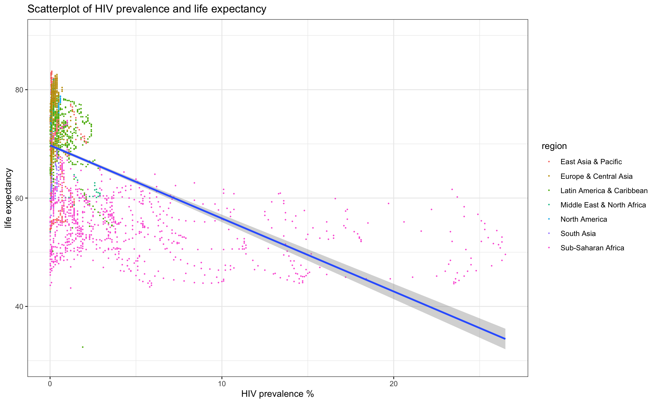
#faceting by regions
hiv_life_expectancy_region <- ggplot(new_dataset, aes(x=hiv_pct, y=life_expectancy))+
geom_point(aes(color=region), size=0.2)+
geom_smooth(method = "lm")+
labs(title = "HIV prevalence and life expectancy by region", y = "Life expectancy ", x= "HIV prevalence %", subtitle = "Scatterplots seperated by regions")+
# xlim(0,3)+
ylim(30,90)+
theme_bw()+
facet_wrap(vars(region), scales = "free" )+
theme(legend.position = "none")+
NULL
hiv_life_expectancy_region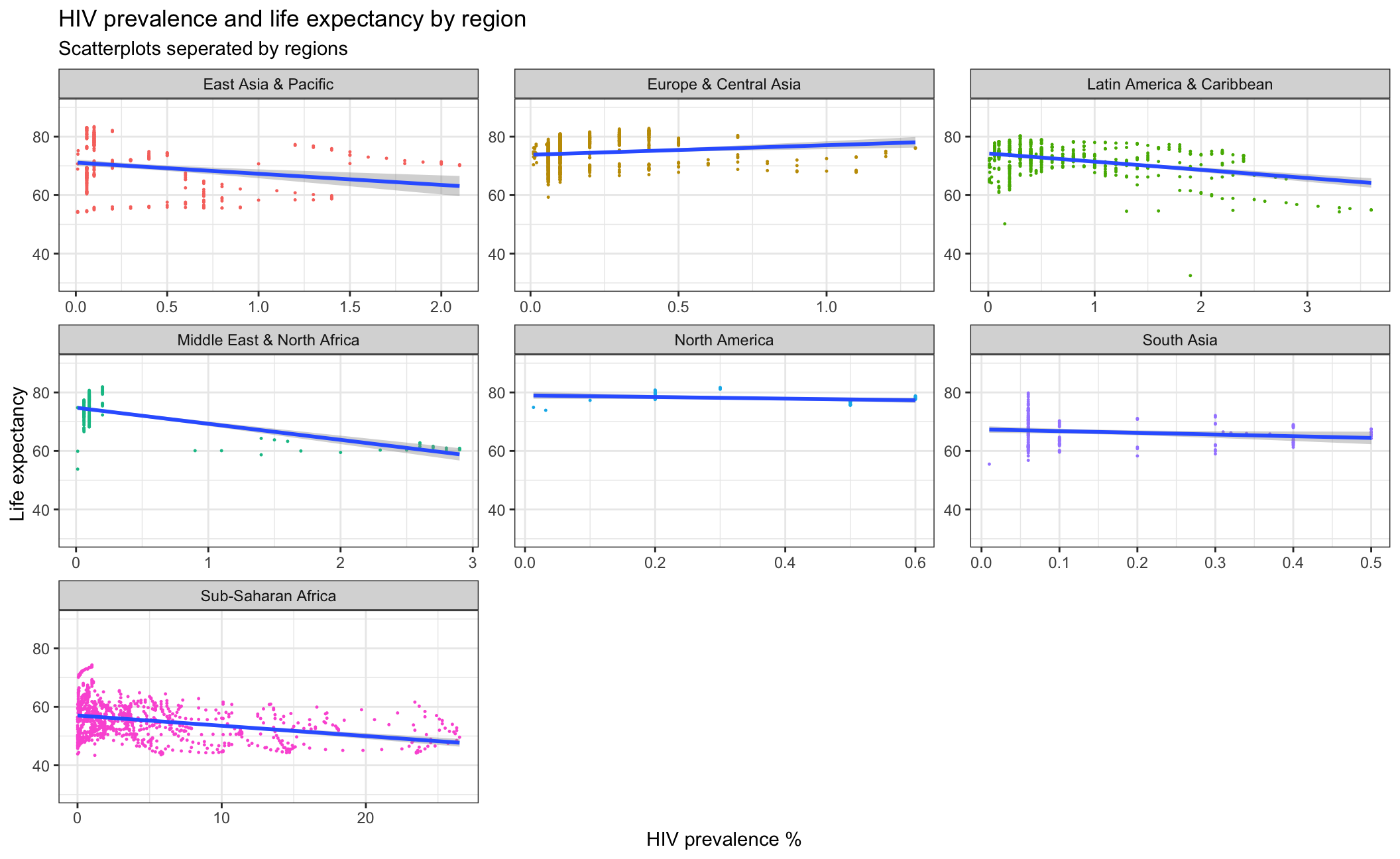 From the scatterplot above, we can observe that HIV prevalence is generally negatively related with life expectancy. Those countries with higher life expectancy are more likely to have lower HIV prevalence rates, probably because those countries are in better medical conditions. As for the difference between regions, most regions show a negative relationship between HIV prevalence and life expectancy, except Europe& Central Asia and North America. This is probably because these regions keep very low HIV prevalence so the pattern is not so obvious. Another point is that Sub-Saharan Africa has a lower life expectancy and higher HIV prevalence compared to other regions.
- What is the relationship between fertility rate and GDP per capita?
#overall condition
fertility_gdp <- ggplot(worldbank2, aes(x=NY.GDP.PCAP.KD, y=SP.DYN.TFRT.IN))+
  geom_point(aes(color=region), size=0.2)+
  ylim(0,10)+
  theme_bw()+
  geom_smooth(method = "lm")+
  labs(title = "Scatterplot of fertility rate and GDP per capita", y = "fertility rate", x= "GDP per capita")+
 # theme(legend.position = "none")+
  xlim(0, 150000)
  NULL
## NULLfertility_gdp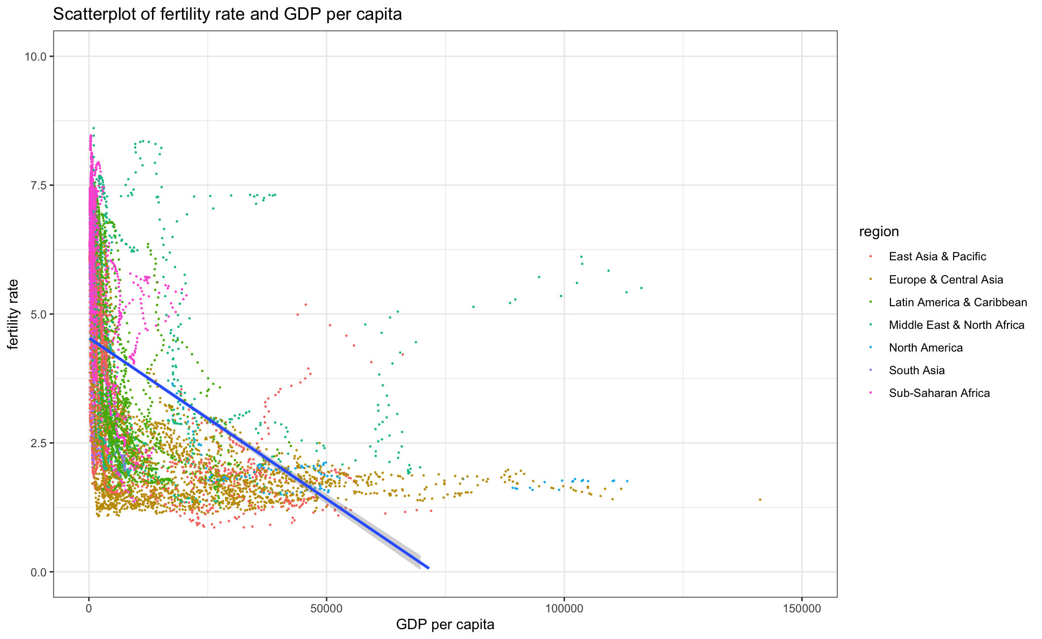
#faceting by regions
fertility_gdp_region <- new_dataset %>%
# filter(year == 2011) %>%
ggplot(aes(x=NY.GDP.PCAP.KD, y=SP.DYN.TFRT.IN))+
geom_point(aes(color=country), size=0.2)+
labs(title = "Scatterplot of fertility rate and GDP per capita by region", y = "Fertility rate", x= "GDP per capita")+
geom_smooth(method = "lm")+
# xlim(0,150000)+
#ylim(30,90)+
theme_bw()+
facet_wrap(vars(region), scales = "free" )+
theme(legend.position = "none")+
NULL
fertility_gdp_region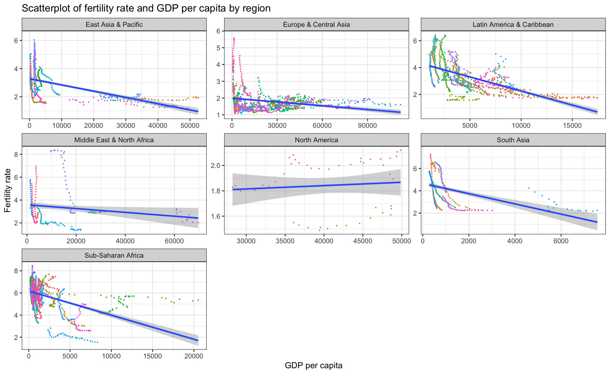 As the scatterplot above indicates, there is a negative correlation between fertility rate and GDP per capita. This relationship is especially strong in regions that are typically less developed such as Sub-Saharan Africa and South Asia. In North America, the trendline is slightly positive, possibly due to the small sample size. Overall, Europe & Central Asia have the lowest fertility rate and highest GDP per capita among all the regions.
- Which regions have the most observations with missing HIV data?
hiv_missing <- new_dataset %>%
group_by(region) %>%
summarize(n_missing(hiv_pct)) %>%
rename("hiv_missing_count"="n_missing(hiv_pct)")
hiv_miss <- ggplot()+
geom_col(data=hiv_missing, aes(x=hiv_missing_count, y=reorder(region,hiv_missing_count),fill=-hiv_missing_count))+
#scale_fill_hue(c = 40)
labs(title = "Missing HIV data count by Region", y = "Region", x= "HIV missing count")+
theme(legend.position = "none")
hiv_miss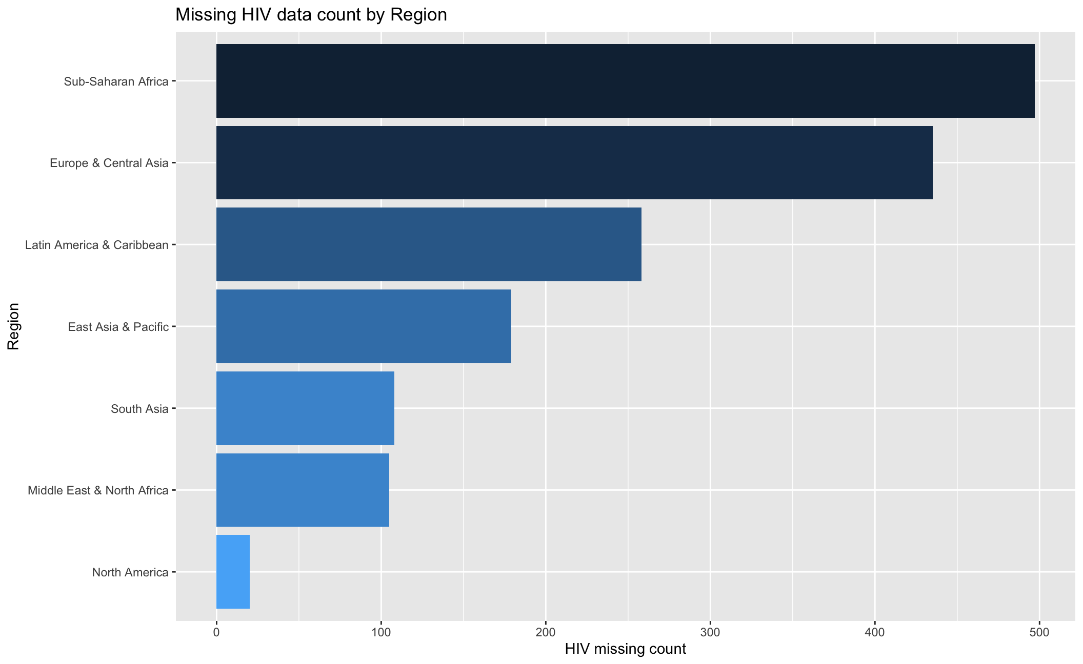 As the barchart indicates, the Sub-Saharan Africa has the most observations with 497 missing HIV data, followed by Europe & Central Asia, which has 435 missing HIV data.
- How has mortality rate under 5 changed by region? In each region, find the top 5 countries that have seen the greatest improvement, as well as those 5 countries where mortality rates have had the least improvement or even deterioration.
#How has mortality rate under 5 changed by region
mortality_by_region <- ggplot(worldbank2, aes(x=year, y=SH.DYN.MORT))+
geom_point(aes(color=country), size=0.2)+
labs(title = "Scatterplot of mortality rate by year per region", y = "Mortality rate under 5", x= "Year")+
geom_smooth(method = "lm")+
theme_bw()+
facet_wrap(vars(region), scales = "free" )+
theme(legend.position = "none")+
NULL
mortality_by_region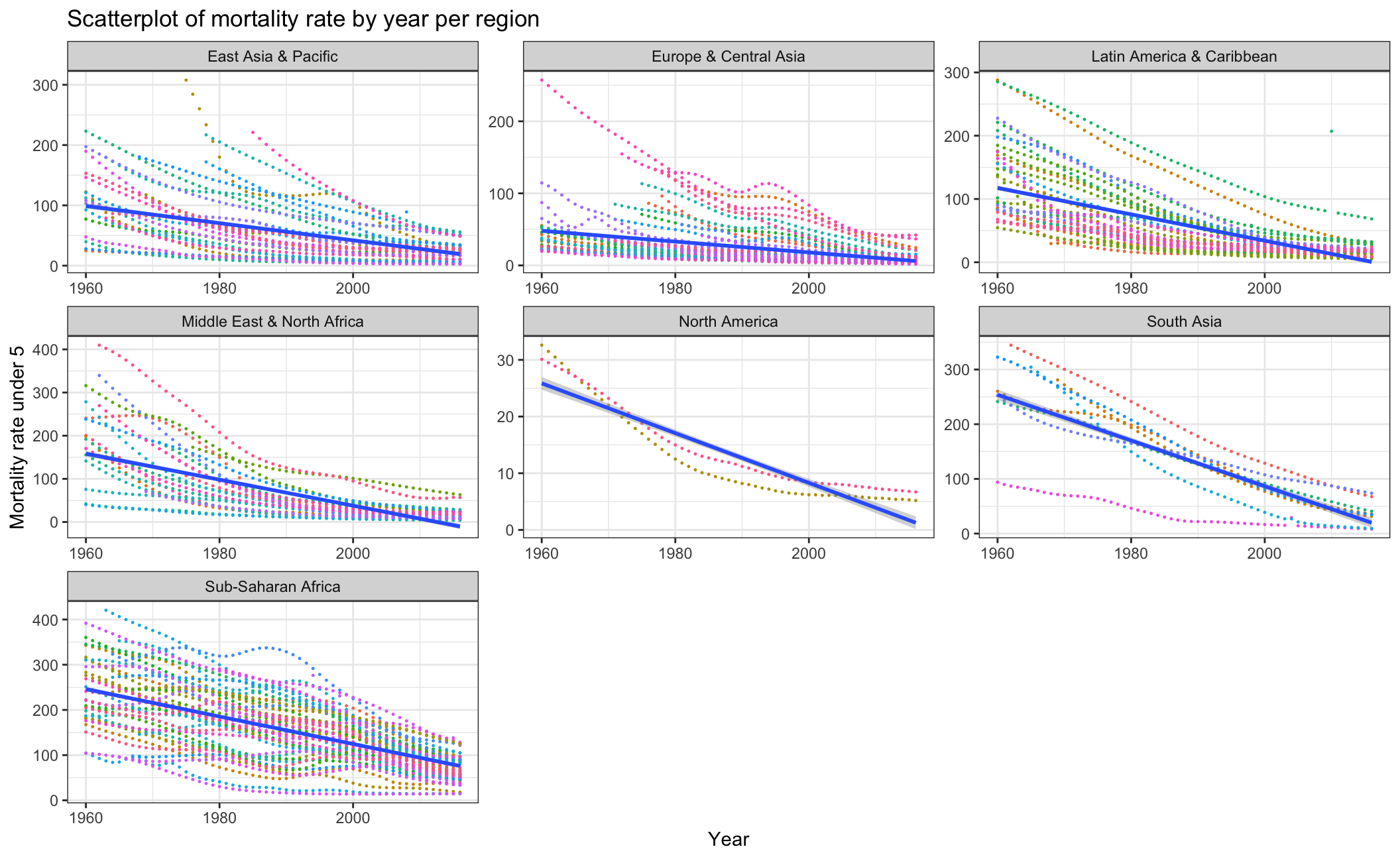 Overall, the mortality rate under 5 has declined since 1960. Among all of the regions, South Asia has the greatest improvement while North America has the least improvement.
#top 5 countries that have seen the greatest improvement in each region

mortality_rate<- worldbank2 %>%
  select(country,region,year,SH.DYN.MORT)

# calculate the improvement  of mortality rate under 5
mortality_improvement <-mortality_rate %>%
   na.omit()%>%
   group_by(region,country) %>%
   mutate(first_rate=first(SH.DYN.MORT),last_rate=last(SH.DYN.MORT))%>%
   summarise(improvement= (first_rate-last_rate)/first_rate)

mortality_improvement <-  mortality_improvement[!duplicated(mortality_improvement ), ]


top_5_country <-mortality_improvement %>%
  group_by(region)%>%
  slice_max(improvement, n=5)
top_5_country
## # A tibble: 32 × 3
## # Groups: region [7]
## region country improvement
## <chr> <chr> <dbl>
## 1 East Asia & Pacific Korea, Rep. 0.970
## 2 East Asia & Pacific Singapore 0.943
## 3 East Asia & Pacific Japan 0.932
## 4 East Asia & Pacific Thailand 0.930
## 5 East Asia & Pacific China 0.916
## 6 Europe & Central Asia Portugal 0.969
## 7 Europe & Central Asia Turkey 0.953
## 8 Europe & Central Asia Italy 0.934
## 9 Europe & Central Asia Cyprus 0.932
## 10 Europe & Central Asia Poland 0.928
## # … with 22 more rowsleast_5_country <-mortality_improvement %>%
group_by(region)%>%
slice_min(improvement, n=5)
least_5_country## # A tibble: 32 × 3
## # Groups: region [7]
## region country improvement
## <chr> <chr> <dbl>
## 1 East Asia & Pacific Micronesia, Fed. Sts. 0.425
## 2 East Asia & Pacific Palau 0.475
## 3 East Asia & Pacific Nauru 0.543
## 4 East Asia & Pacific Tuvalu 0.672
## 5 East Asia & Pacific Fiji 0.680
## 6 Europe & Central Asia Monaco 0.649
## 7 Europe & Central Asia Turkmenistan 0.682
## 8 Europe & Central Asia Slovak Republic 0.718
## 9 Europe & Central Asia Ukraine 0.728
## 10 Europe & Central Asia Moldova 0.761
## # … with 22 more rowstop_5_country_bar <- ggplot()+
geom_col(data=top_5_country, aes(x=reorder(country,-improvement), y=improvement,fill=improvement))+
facet_wrap(vars(region), scales = "free_x" )+
labs(title = "Top 5 countries that have greatest improvement", y = "improvement", x= "country")+
#theme(legend.position = "none")+
NULL
top_5_country_bar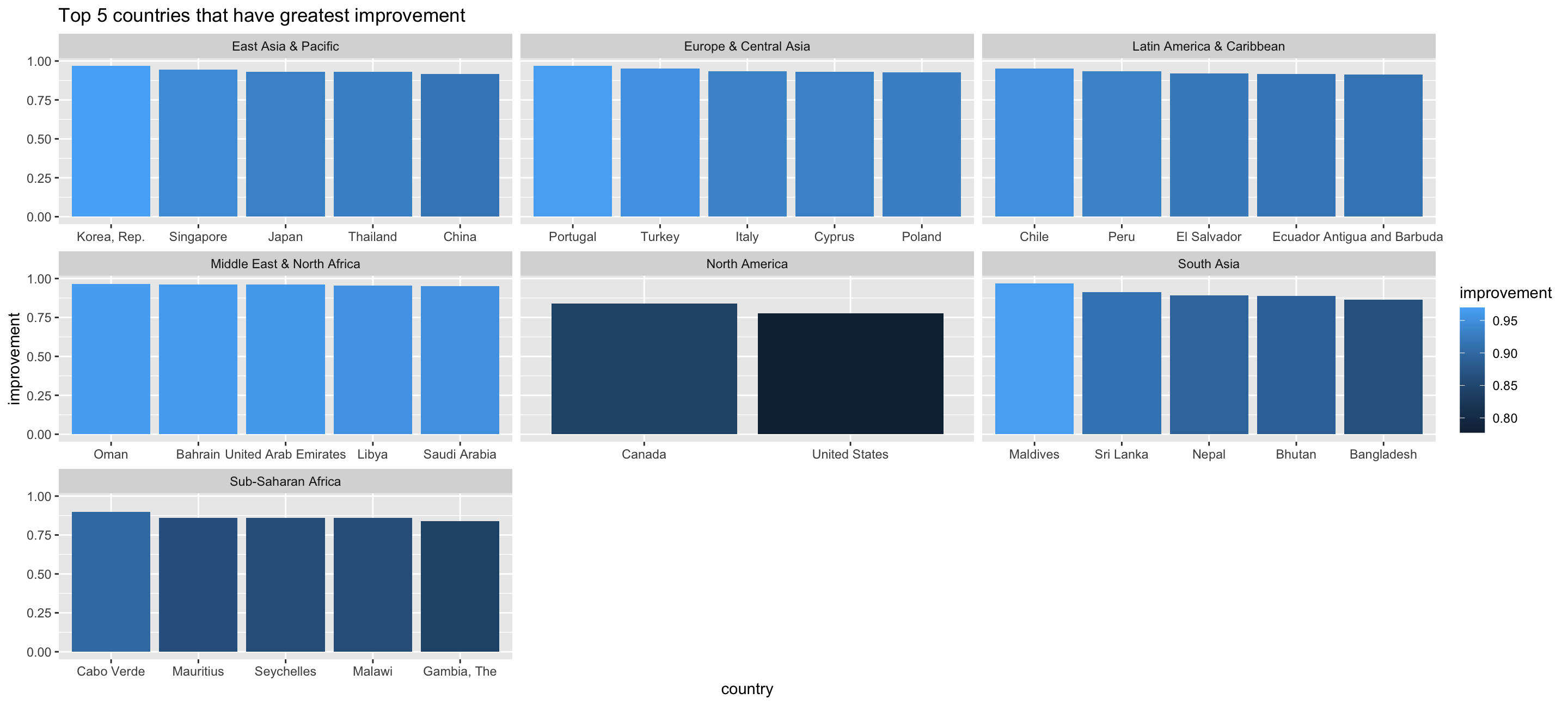
least_5_country_bar <- ggplot()+
geom_col(data=least_5_country, aes(x=reorder(country,-improvement), y=improvement,fill=improvement))+
facet_wrap(vars(region), scales = "free_x" )+
labs(title = "Top 5 countries that have least improvement", y = "improvement", x= "country")+
#theme(legend.position = "none")+
NULL
least_5_country_bar 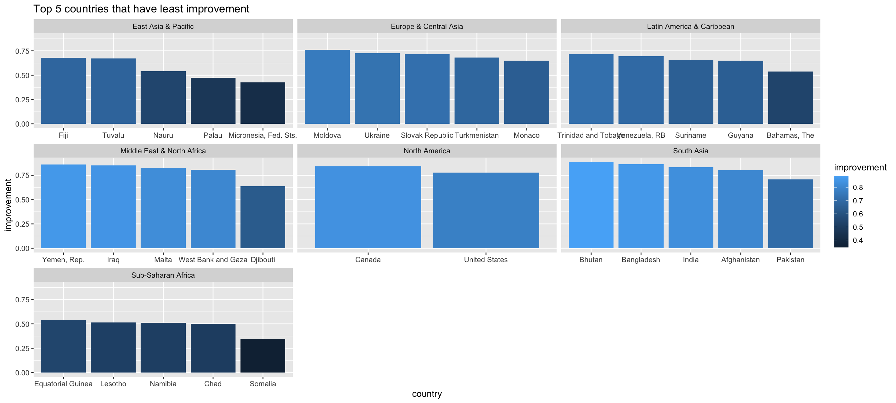 The tables above show the Top 5 countries that have experienced the greatest/least improvement in mortality rate from 1960 to 2016 by region. For instance, in east Asia & Pacific Korea, Rep., Singapore, Japan, Thailand and China have made the greatest improvement while in Micronesia Palau, Nauru, Tuvalu and Fiji have made the least improvement. As for South Asia and North America, since the number of the countries is less than 10, the Top 5 and Last 5 are not very representative. We didn’t observe that there is any deterioration in mortality rate so far. The country that experienced the least improvement is Somalia in Sub-Saharan Africa with 0.346 improvement.
- Is there a relationship between primary school enrollment and fertility rate?
school_fertility <- ggplot(worldbank2, aes(x=SE.PRM.NENR, y=SP.DYN.TFRT.IN))+
  geom_point(aes(color=region), size=0.5)+
  labs(title = "Scatterplot of fertility rate and primary school enrollment", y = "fertility rate", x= "primary school enrollment")+
  geom_smooth(method = "lm")+
  theme_bw()+
  NULL
school_fertility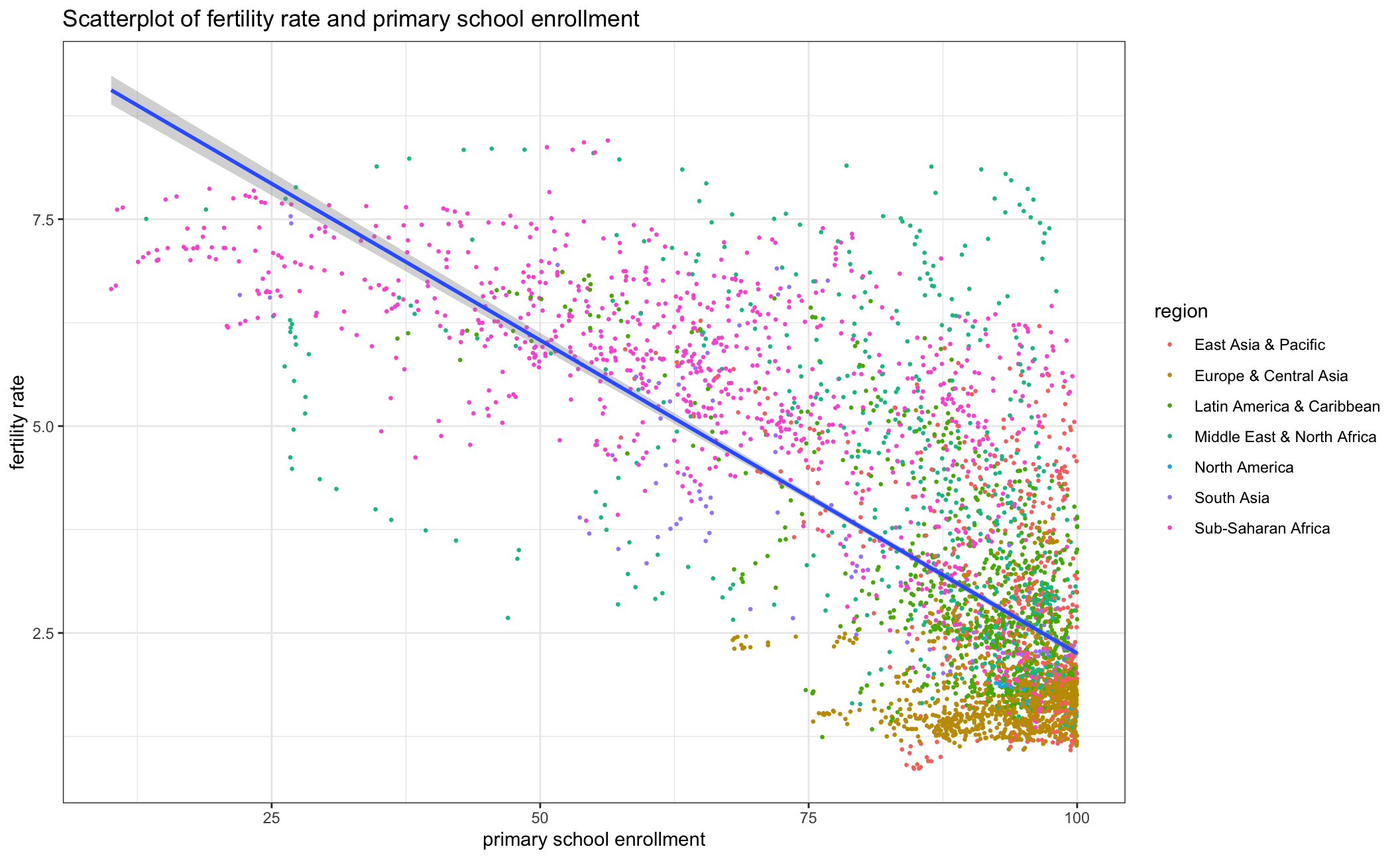
school_fertility_region <- ggplot(worldbank2, aes(x=SE.PRM.NENR, y=SP.DYN.TFRT.IN))+
  geom_point(aes(color=region), size=0.2)+
  labs(title = "Scatterplot of fertility rate and primary school enrollment by region", y = "fertility rate", x= "primary school enrollment")+
  geom_smooth(method = "lm")+
  theme_bw()+
  facet_wrap(vars(region), scales = "free" )+
  theme(legend.position = "none")+
  NULL
school_fertility_region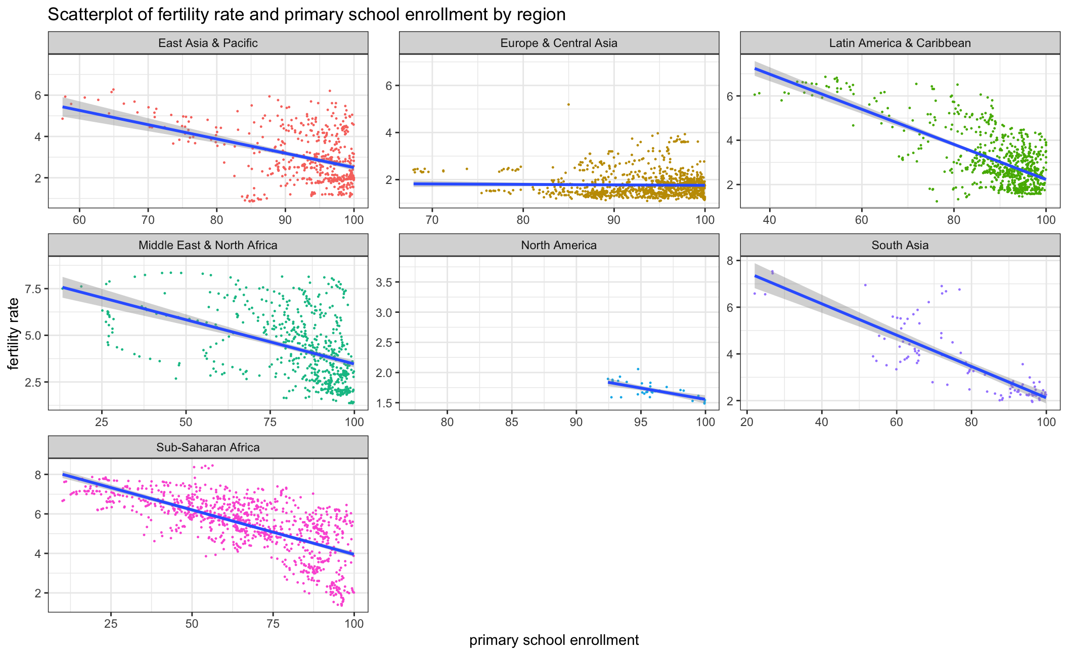
fertility_change <- ggplot(worldbank2, aes(x=year, y=SP.DYN.TFRT.IN))+
  geom_point(aes(color=country), size=0.2)+
  labs(title = "Scatterplot of fertility rate by year per region", y = "fertility rate", x= "year")+
  geom_smooth(method = "lm")+
  theme_bw()+
  facet_wrap(vars(region), scales = "free" )+
  theme(legend.position = "none")+
  NULL
fertility_change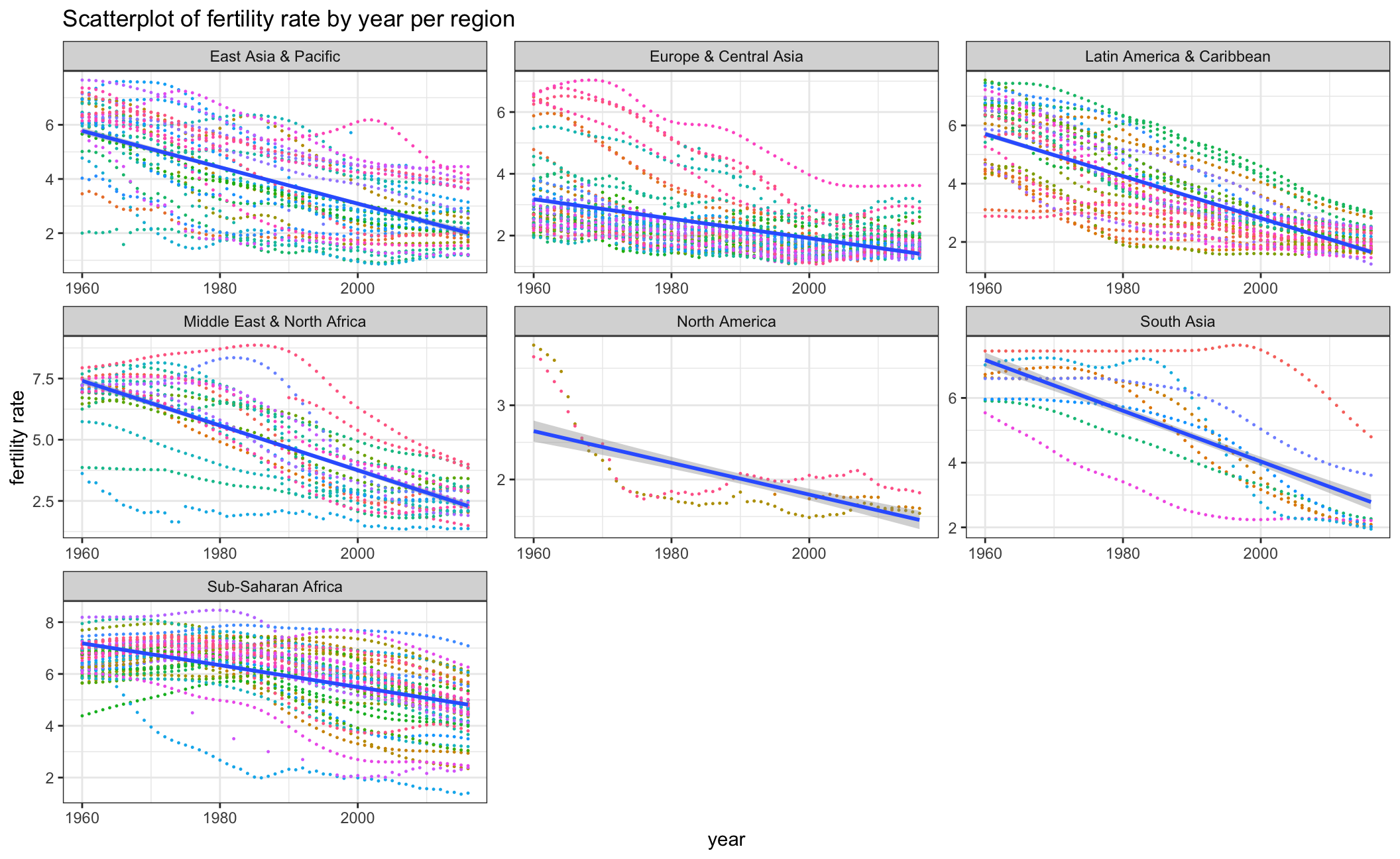
enrollment_change<- ggplot(worldbank2, aes(x=year, y=SE.PRM.NENR))+
  geom_point(aes(color=country), size=0.2)+
  labs(title = "Scatterplot of primary school enrollment rate by year per region", y = "primary school enrollment", x= "year")+
  geom_smooth(method = "lm")+
  theme_bw()+
  facet_wrap(vars(region), scales = "free" )+
  theme(legend.position = "none")+
  xlim(1970,2011)
  NULL
## NULLenrollment_change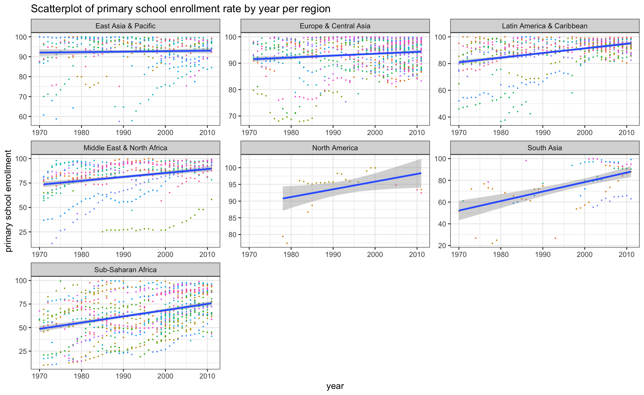
As the first and second scatterplot above indicates, there is a negative correlation between fertility rate and primary school enrollment rate. To explore the reason, we took a further look at how fertility rate and primary school enrollment rate have changed from 1960 to 2016 by each country in the respective regions. We can observe an obvious fertility rate decline as well as a rise in primary school enrollment which indicates the overall educational level has improved over the years. This may furthermore explain the negative correlation between fertility rate and primary school enrollment rate.