Project 3 GDP Global Comparison
Author:Jiaying Chen, Yingjin He, Sabrina Seow, Kashish Solanki, Roman Vazquez Lorenzo, Maximilian Stock
At the risk of oversimplifying things, the main components of gross domestic product, GDP are personal consumption (C), business investment (I), government spending (G) and net exports (exports - imports). You can read more about GDP and the different approaches in calculating at the Wikipedia GDP page.
The GDP data we will look at is from the United Nations’ National Accounts Main Aggregates Database, which contains estimates of total GDP and its components for all countries from 1970 to today. We will look at how GDP and its components have changed over time, and compare different countries and how much each component contributes to that country’s GDP. The file we will work with is GDP and its breakdown at constant 2010 prices in US Dollars and it has already been saved in the Data directory. Have a look at the Excel file to see how it is structured and organised
UN_GDP_data  <-  read_excel(here::here("data", "Download-GDPconstant-USD-countries.xls"), # Excel filename
                sheet="Download-GDPconstant-USD-countr", # Sheet name
                skip=2) # Number of rows to skip
First, we tidy the data and select several countries to explore.
tidy_GDP_data  <-  UN_GDP_data %>%
  pivot_longer(cols = 4:51, values_to = "gdp_in_billion", names_to = "years") %>%
  mutate(gdp_in_billion = gdp_in_billion/10^9)

tidy_GDP_data
## # A tibble: 176,880 × 5
## CountryID Country IndicatorName years gdp_in_billion
## <dbl> <chr> <chr> <chr> <dbl>
## 1 4 Afghanistan Final consumption expenditure 1970 5.56
## 2 4 Afghanistan Final consumption expenditure 1971 5.33
## 3 4 Afghanistan Final consumption expenditure 1972 5.20
## 4 4 Afghanistan Final consumption expenditure 1973 5.75
## 5 4 Afghanistan Final consumption expenditure 1974 6.15
## 6 4 Afghanistan Final consumption expenditure 1975 6.32
## 7 4 Afghanistan Final consumption expenditure 1976 6.37
## 8 4 Afghanistan Final consumption expenditure 1977 6.90
## 9 4 Afghanistan Final consumption expenditure 1978 7.09
## 10 4 Afghanistan Final consumption expenditure 1979 6.92
## # … with 176,870 more rowsglimpse(tidy_GDP_data)## Rows: 176,880
## Columns: 5
## $ CountryID <dbl> 4, 4, 4, 4, 4, 4, 4, 4, 4, 4, 4, 4, 4, 4, 4, 4, 4, 4, 4…
## $ Country <chr> "Afghanistan", "Afghanistan", "Afghanistan", "Afghanist…
## $ IndicatorName <chr> "Final consumption expenditure", "Final consumption exp…
## $ years <chr> "1970", "1971", "1972", "1973", "1974", "1975", "1976",…
## $ gdp_in_billion <dbl> 5.56, 5.33, 5.20, 5.75, 6.15, 6.32, 6.37, 6.90, 7.09, 6…skim(tidy_GDP_data)| Name | tidy_GDP_data |
| Number of rows | 176880 |
| Number of columns | 5 |
| _______________________ | |
| Column type frequency: | |
| character | 3 |
| numeric | 2 |
| ________________________ | |
| Group variables | None |
Variable type: character
| skim_variable | n_missing | complete_rate | min | max | empty | n_unique | whitespace |
|---|---|---|---|---|---|---|---|
| Country | 0 | 1 | 4 | 34 | 0 | 220 | 0 |
| IndicatorName | 0 | 1 | 17 | 88 | 0 | 17 | 0 |
| years | 0 | 1 | 4 | 4 | 0 | 48 | 0 |
Variable type: numeric
| skim_variable | n_missing | complete_rate | mean | sd | p0 | p25 | p50 | p75 | p100 | hist |
|---|---|---|---|---|---|---|---|---|---|---|
| CountryID | 0 | 1.00 | 439.2 | 254 | 4 | 214.00 | 440.0 | 660.0 | 894 | ▇▇▇▇▆ |
| gdp_in_billion | 15421 | 0.91 | 72.2 | 447 | -568 | 0.36 | 2.5 | 17.9 | 17349 | ▇▁▁▁▁ |
# Let us compare GDP components for these 6 countries, including our own countries China, Malaysia and Spain
country_list <- c("United States","Spain","China", "Germany", "India", "Malaysia")
indicator_list <- c("Gross capital formation","Imports of goods and services", "General government final consumption expenditure", "Household consumption expenditure (including Non-profit institutions serving households)", "Exports of goods and services")
gdp_plot <-tidy_GDP_data[which(tidy_GDP_data$Country %in% country_list),]
gdp_plot <-gdp_plot[which(gdp_plot$IndicatorName %in% indicator_list),]
plot_gdp <- ggplot(gdp_plot, aes(x = as.integer(years),y=gdp_in_billion))+
geom_line(aes(color = IndicatorName))+
facet_wrap(vars(Country))+
labs(title = "GDP components over time",subtitle = 'In constant 2010 USD', y = "Billion US$", x= "year")+
scale_colour_hue("Components of GDP",labels=c("Exports ","Government Expenditure","Gross capital formation","Household Expenditure","Imports"))+
theme_bw()+
NULL
plot_gdp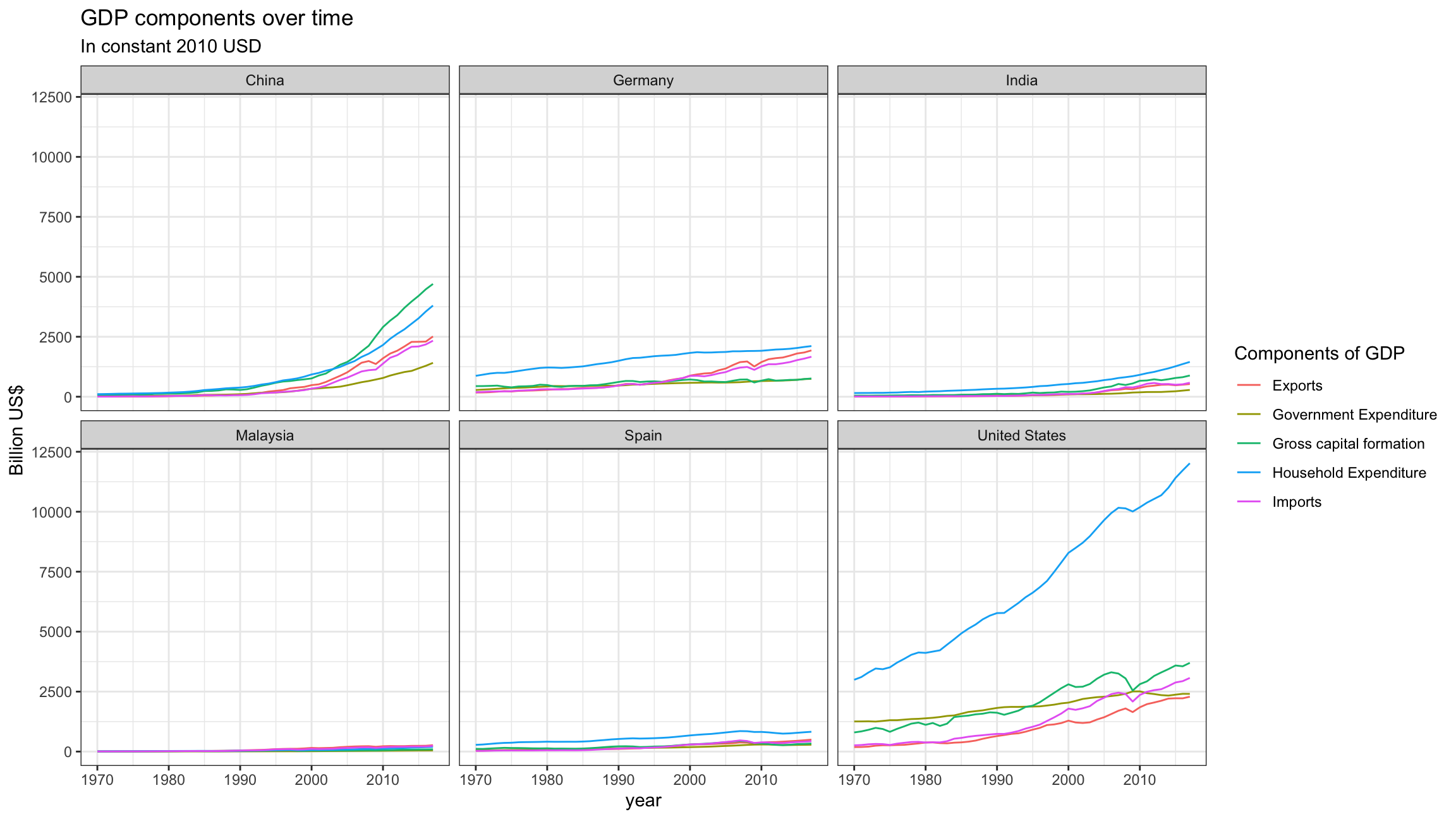
Secondly, recall that GDP is the sum of Household Expenditure (Consumption C), Gross Capital Formation (business investment I), Government Expenditure (G) and Net Exports (exports - imports). Even though there is an indicator Gross Domestic Product (GDP) in your dataframe, I would like you to calculate it given its components discussed above.
What is the % difference between what you calculated as GDP and the GDP figure included in the dataframe?
gdp_diff is the % difference between the calculated GDP(gdp_sum) and the GDP figure in the dataframe. The mean of gdp_diff is -0.5%, which indicates that the GDP we calculated is slightly lower than the figure given. This is probably because the calculated one is expenditure approach while GDP figure is usually calculated by income approach or production approach. The measurement error in practice made two figures slightly off.
indicator_list2 <- c("Gross capital formation","Imports of goods and services", "General government final consumption expenditure", "Household consumption expenditure (including Non-profit institutions serving households)", "Exports of goods and services", "Gross Domestic Product (GDP)")

gdp_plot <-tidy_GDP_data[which(tidy_GDP_data$Country %in% country_list),]
gdp_plot <-gdp_plot[which(gdp_plot$IndicatorName %in% indicator_list2),]

gdp_plot2<-pivot_wider(gdp_plot,names_from  = IndicatorName, values_from  = gdp_in_billion)

colnames(gdp_plot2)<-c("countryID","country","years","Household_Expenditure","Government_Expenditure","Gross_Capital_Formation","Exports","Imports","gdp_origin")

 gdp_plot2<-gdp_plot2 %>%
   mutate(Net_Exports = Exports-Imports, gdp_sum=Household_Expenditure +Government_Expenditure+Gross_Capital_Formation+Net_Exports,h_pro=Household_Expenditure/gdp_sum,g_pro=Government_Expenditure/gdp_sum,c_pro=Gross_Capital_Formation/gdp_sum,n_pro= Net_Exports/gdp_sum,gdp_diff=(gdp_sum/gdp_origin)-1)

skim(gdp_plot2)| Name | gdp_plot2 |
| Number of rows | 288 |
| Number of columns | 16 |
| _______________________ | |
| Column type frequency: | |
| character | 2 |
| numeric | 14 |
| ________________________ | |
| Group variables | None |
Variable type: character
| skim_variable | n_missing | complete_rate | min | max | empty | n_unique | whitespace |
|---|---|---|---|---|---|---|---|
| country | 0 | 1 | 5 | 13 | 0 | 6 | 0 |
| years | 0 | 1 | 4 | 4 | 0 | 48 | 0 |
Variable type: numeric
| skim_variable | n_missing | complete_rate | mean | sd | p0 | p25 | p50 | p75 | p100 | hist |
|---|---|---|---|---|---|---|---|---|---|---|
| countryID | 0 | 1 | 468.33 | 242.21 | 156.00 | 276.00 | 407.00 | 724.00 | 840.00 | ▇▃▃▁▇ |
| Household_Expenditure | 0 | 1 | 1765.53 | 2649.33 | 9.53 | 213.48 | 718.46 | 1847.68 | 12021.14 | ▇▁▁▁▁ |
| Government_Expenditure | 0 | 1 | 498.20 | 678.21 | 2.12 | 44.32 | 180.56 | 591.64 | 2510.14 | ▇▁▁▁▁ |
| Gross_Capital_Formation | 0 | 1 | 713.84 | 972.14 | 3.39 | 93.36 | 330.50 | 730.71 | 4702.06 | ▇▁▁▁▁ |
| Exports | 0 | 1 | 468.56 | 592.57 | 5.08 | 56.17 | 240.85 | 529.75 | 2513.01 | ▇▁▁▁▁ |
| Imports | 0 | 1 | 491.98 | 662.71 | 4.59 | 51.97 | 233.60 | 571.10 | 3069.95 | ▇▁▁▁▁ |
| gdp_origin | 0 | 1 | 2943.93 | 4028.73 | 18.70 | 350.11 | 1321.16 | 3295.53 | 17348.63 | ▇▁▁▁▁ |
| Net_Exports | 0 | 1 | -23.42 | 181.85 | -830.27 | -18.88 | 1.05 | 27.75 | 380.67 | ▁▁▁▇▁ |
| gdp_sum | 0 | 1 | 2954.15 | 4042.71 | 16.90 | 350.95 | 1301.92 | 3297.83 | 17342.08 | ▇▁▁▁▁ |
| h_pro | 0 | 1 | 0.57 | 0.09 | 0.36 | 0.51 | 0.58 | 0.63 | 0.72 | ▂▂▅▇▃ |
| g_pro | 0 | 1 | 0.15 | 0.04 | 0.08 | 0.12 | 0.14 | 0.18 | 0.25 | ▆▇▅▆▁ |
| c_pro | 0 | 1 | 0.26 | 0.08 | 0.15 | 0.21 | 0.23 | 0.30 | 0.48 | ▆▇▂▃▁ |
| n_pro | 0 | 1 | 0.02 | 0.06 | -0.06 | -0.01 | 0.00 | 0.04 | 0.27 | ▇▅▂▁▁ |
| gdp_diff | 0 | 1 | -0.01 | 0.03 | -0.10 | -0.02 | 0.00 | 0.01 | 0.07 | ▁▁▇▅▁ |
 gap_perc_plot <- ggplot(gdp_plot2, aes(x = as.integer(years)))+
                                   facet_wrap(vars(country))+
                          geom_line(aes(y=h_pro,color="#339999"))+
                         geom_line(aes(y=c_pro,color="#00CC00"))+
                         geom_line(aes(y=g_pro,color="#FF3300"))+
                         geom_line(aes(y=n_pro,color="purple"))+
               # theme(panel.border = element_rect(colour = NA, fill=NA))+
                scale_y_continuous(labels = scales::percent)+
                theme_bw()+
   labs(title = "GDP and its breakdown at constant 2010 prices in US Dollars ", y = "proportion", x= "year")+
   scale_color_identity(breaks = c("#339999", "#00CC00", "#FF3300", "purple"),
                        labels = c("Household Expenditure", "Gross capital formation", "Government Expenditure", "Net Exports"),
                        guide = "legend",
                        name = "Legend")+
                NULL


gap_perc_plot 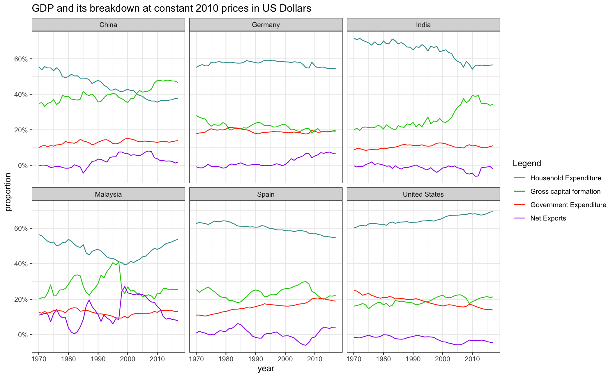
What is this last chart telling you? Can you explain in a couple of paragraphs the different dynamic among these three countries?
The last chart has displayed how percentage of investment(capital formation), consumption(household expenditure), net exports and government expenditure among GDP has changed over time for Germany, India and the United States. The patterns are indicating various characteristic of the countries’ economy.
As for Germany, the largest economy in Europe, the proportion of GDP components is generally stable from 1970 to 2000 with around 60% household expenditure, 20% capital expenditure, 20% government expenditure and 0% net exports. Since 2000, Net Export in Germany has exoerienced a sharp rise while household expenditure gradually fell by 5%. Compared with India and United States, an obvious characteristic of Germany’s economy is the trade surplus since 2000, which indicates the economic development is more dependent on international trade.
As for India,the fastest growing major economy throughout the world, we can observe a sharp fall in household expenditure since 1970 and a quick rise in capital formation since 2000, which means the engine of economic growth is switching from consumption to investment. Thanks to the broad economic liberalisation in India in 1990s, the growth in investment results from the incredible increase in foreign direct investment, and this finally benefits India’s economy.
As for the United States, the proportion of consumption and investment are gradually rising while government expenditure and net export are falling. Compared to the other countries, US seems like a consumption-oriented economy with values of around 70%. Since 1990, the US trade deficit has widened. A sudden decrease in 2008-2009 in investment sector might be attributed to the subprime mortgage crisis of the US.
We also included our own countries China, Malaysia and Spain. For China, unlike the other 5 countries, investment has exceeded consumption in 2004 and become the most important engine of economic growth. Net exports have been over zero since 1990. Trade surplus indicates that international trade makes up a sizeable portion of China’s overall economy. Since economic reforms began in the late 1970s, China sought to decentralize its foreign trade system to integrate itself into the international trading system. These efforts made China one of the world’s largest exporter of goods and can explain the trade surplus in the plot.
Moreover, the proportion of investment in Malaysia is growing fast from 1970. A possible reason is that in the 1970s, Malaysia began to imitate the four Asian Tiger economies (South Korea, Taiwan, Hong Kong and Singapore) and committed itself to a transition from being reliant on mining and agriculture to an economy that depends more on manufacturing. The sudden decrease in investment in 1997 is probably the result of Asian financial crisis. Since 1997, net exports stand for over 20% of GDP in Malaysia. Malaysian exports became the country’s primary growth engine. Malaysia now is a typical export-oriented economy.
Finally, the proportion of components of GDP in Spain is generally stable with government expenses gradually rising since 1970 by a total of 10%. The sudden decrease in its investment sector by 10% in 2008-2009 shows that the financial crisis also impacted Spain and made its economy plunge into a recession. The change in net export indicates that Spain managed to reverse the trade deficit which had built since 2003 and eventually attained a trade surplus in 2010.