Project 1 IBM HR Analytics

Author:Jiaying Chen, Yingjin He, Sabrina Seow, Kashish Solanki, Roman Vazquez Lorenzo, Maximilian Stock
hr_dataset <- read_csv(here::here("data", "datasets_1067_1925_WA_Fn-UseC_-HR-Employee-Attrition.csv"))
glimpse(hr_dataset)
## Rows: 1,470
## Columns: 35
## $ Age <dbl> 41, 49, 37, 33, 27, 32, 59, 30, 38, 36, 35, 2…
## $ Attrition <chr> "Yes", "No", "Yes", "No", "No", "No", "No", "…
## $ BusinessTravel <chr> "Travel_Rarely", "Travel_Frequently", "Travel…
## $ DailyRate <dbl> 1102, 279, 1373, 1392, 591, 1005, 1324, 1358,…
## $ Department <chr> "Sales", "Research & Development", "Research …
## $ DistanceFromHome <dbl> 1, 8, 2, 3, 2, 2, 3, 24, 23, 27, 16, 15, 26, …
## $ Education <dbl> 2, 1, 2, 4, 1, 2, 3, 1, 3, 3, 3, 2, 1, 2, 3, …
## $ EducationField <chr> "Life Sciences", "Life Sciences", "Other", "L…
## $ EmployeeCount <dbl> 1, 1, 1, 1, 1, 1, 1, 1, 1, 1, 1, 1, 1, 1, 1, …
## $ EmployeeNumber <dbl> 1, 2, 4, 5, 7, 8, 10, 11, 12, 13, 14, 15, 16,…
## $ EnvironmentSatisfaction <dbl> 2, 3, 4, 4, 1, 4, 3, 4, 4, 3, 1, 4, 1, 2, 3, …
## $ Gender <chr> "Female", "Male", "Male", "Female", "Male", "…
## $ HourlyRate <dbl> 94, 61, 92, 56, 40, 79, 81, 67, 44, 94, 84, 4…
## $ JobInvolvement <dbl> 3, 2, 2, 3, 3, 3, 4, 3, 2, 3, 4, 2, 3, 3, 2, …
## $ JobLevel <dbl> 2, 2, 1, 1, 1, 1, 1, 1, 3, 2, 1, 2, 1, 1, 1, …
## $ JobRole <chr> "Sales Executive", "Research Scientist", "Lab…
## $ JobSatisfaction <dbl> 4, 2, 3, 3, 2, 4, 1, 3, 3, 3, 2, 3, 3, 4, 3, …
## $ MaritalStatus <chr> "Single", "Married", "Single", "Married", "Ma…
## $ MonthlyIncome <dbl> 5993, 5130, 2090, 2909, 3468, 3068, 2670, 269…
## $ MonthlyRate <dbl> 19479, 24907, 2396, 23159, 16632, 11864, 9964…
## $ NumCompaniesWorked <dbl> 8, 1, 6, 1, 9, 0, 4, 1, 0, 6, 0, 0, 1, 0, 5, …
## $ Over18 <chr> "Y", "Y", "Y", "Y", "Y", "Y", "Y", "Y", "Y", …
## $ OverTime <chr> "Yes", "No", "Yes", "Yes", "No", "No", "Yes",…
## $ PercentSalaryHike <dbl> 11, 23, 15, 11, 12, 13, 20, 22, 21, 13, 13, 1…
## $ PerformanceRating <dbl> 3, 4, 3, 3, 3, 3, 4, 4, 4, 3, 3, 3, 3, 3, 3, …
## $ RelationshipSatisfaction <dbl> 1, 4, 2, 3, 4, 3, 1, 2, 2, 2, 3, 4, 4, 3, 2, …
## $ StandardHours <dbl> 80, 80, 80, 80, 80, 80, 80, 80, 80, 80, 80, 8…
## $ StockOptionLevel <dbl> 0, 1, 0, 0, 1, 0, 3, 1, 0, 2, 1, 0, 1, 1, 0, …
## $ TotalWorkingYears <dbl> 8, 10, 7, 8, 6, 8, 12, 1, 10, 17, 6, 10, 5, 3…
## $ TrainingTimesLastYear <dbl> 0, 3, 3, 3, 3, 2, 3, 2, 2, 3, 5, 3, 1, 2, 4, …
## $ WorkLifeBalance <dbl> 1, 3, 3, 3, 3, 2, 2, 3, 3, 2, 3, 3, 2, 3, 3, …
## $ YearsAtCompany <dbl> 6, 10, 0, 8, 2, 7, 1, 1, 9, 7, 5, 9, 5, 2, 4,…
## $ YearsInCurrentRole <dbl> 4, 7, 0, 7, 2, 7, 0, 0, 7, 7, 4, 5, 2, 2, 2, …
## $ YearsSinceLastPromotion <dbl> 0, 1, 0, 3, 2, 3, 0, 0, 1, 7, 0, 0, 4, 1, 0, …
## $ YearsWithCurrManager <dbl> 5, 7, 0, 0, 2, 6, 0, 0, 8, 7, 3, 8, 3, 2, 3, …head(hr_cleaned)## # A tibble: 6 × 19
## age attrition daily_rate department distance_from_ho… education gender
## <dbl> <chr> <dbl> <chr> <dbl> <chr> <chr>
## 1 41 Yes 1102 Sales 1 College Female
## 2 49 No 279 Research & Dev… 8 Below Col… Male
## 3 37 Yes 1373 Research & Dev… 2 College Male
## 4 33 No 1392 Research & Dev… 3 Master Female
## 5 27 No 591 Research & Dev… 2 Below Col… Male
## 6 32 No 1005 Research & Dev… 2 College Male
## # … with 12 more variables: job_role <chr>, environment_satisfaction <chr>,
## # job_satisfaction <chr>, marital_status <chr>, monthly_income <dbl>,
## # num_companies_worked <dbl>, percent_salary_hike <dbl>,
## # performance_rating <chr>, total_working_years <dbl>,
## # work_life_balance <chr>, years_at_company <dbl>,
## # years_since_last_promotion <dbl>skim(hr_cleaned)| Name | hr_cleaned |
| Number of rows | 1470 |
| Number of columns | 19 |
| _______________________ | |
| Column type frequency: | |
| character | 10 |
| numeric | 9 |
| ________________________ | |
| Group variables | None |
Variable type: character
| skim_variable | n_missing | complete_rate | min | max | empty | n_unique | whitespace |
|---|---|---|---|---|---|---|---|
| attrition | 0 | 1 | 2 | 3 | 0 | 2 | 0 |
| department | 0 | 1 | 5 | 22 | 0 | 3 | 0 |
| education | 0 | 1 | 6 | 13 | 0 | 5 | 0 |
| gender | 0 | 1 | 4 | 6 | 0 | 2 | 0 |
| job_role | 0 | 1 | 7 | 25 | 0 | 9 | 0 |
| environment_satisfaction | 0 | 1 | 3 | 9 | 0 | 4 | 0 |
| job_satisfaction | 0 | 1 | 3 | 9 | 0 | 4 | 0 |
| marital_status | 0 | 1 | 6 | 8 | 0 | 3 | 0 |
| performance_rating | 0 | 1 | 9 | 11 | 0 | 2 | 0 |
| work_life_balance | 0 | 1 | 3 | 6 | 0 | 4 | 0 |
Variable type: numeric
| skim_variable | n_missing | complete_rate | mean | sd | p0 | p25 | p50 | p75 | p100 | hist |
|---|---|---|---|---|---|---|---|---|---|---|
| age | 0 | 1 | 36.92 | 9.14 | 18 | 30 | 36 | 43 | 60 | ▂▇▇▃▂ |
| daily_rate | 0 | 1 | 802.49 | 403.51 | 102 | 465 | 802 | 1157 | 1499 | ▇▇▇▇▇ |
| distance_from_home | 0 | 1 | 9.19 | 8.11 | 1 | 2 | 7 | 14 | 29 | ▇▅▂▂▂ |
| monthly_income | 0 | 1 | 6502.93 | 4707.96 | 1009 | 2911 | 4919 | 8379 | 19999 | ▇▅▂▁▂ |
| num_companies_worked | 0 | 1 | 2.69 | 2.50 | 0 | 1 | 2 | 4 | 9 | ▇▃▂▂▁ |
| percent_salary_hike | 0 | 1 | 15.21 | 3.66 | 11 | 12 | 14 | 18 | 25 | ▇▅▃▂▁ |
| total_working_years | 0 | 1 | 11.28 | 7.78 | 0 | 6 | 10 | 15 | 40 | ▇▇▂▁▁ |
| years_at_company | 0 | 1 | 7.01 | 6.13 | 0 | 3 | 5 | 9 | 40 | ▇▂▁▁▁ |
| years_since_last_promotion | 0 | 1 | 2.19 | 3.22 | 0 | 0 | 1 | 3 | 15 | ▇▁▁▁▁ |
The hr_cleaned dataset holds fictional information of a total of 1470 employees on variables such as the employees’ education, job specifics, performance and attrition. All in all, there are 9 numeric and 10 non-numeric variables
Given the wide range of information, one can try to make inferences about dependencies among variables. For example, it might be interesting to find out if a combination of variables might be a good predictor for an employee’s decision to leave the company (attrition = Yes).
- How often do people leave the company (
attrition)
number_attrition<-hr_cleaned%>%
  group_by(attrition)%>%
  summarize(number_count = count(attrition))%>%
  mutate(perc = number_count/sum(number_count)) #we introduce a second column, namely percent, to represent the count as a percentage of the total

number_attrition
## # A tibble: 2 × 3
## attrition number_count perc
## <chr> <int> <dbl>
## 1 No 1233 0.839
## 2 Yes 237 0.161Looking at the sheer counts of YES and NO entries for the attrition column, around 237 of all employees have left the company. This corresponds to a percentage of around 16% of all recorded employees. At the same time, 1233 employees have been staying with the company.
In addition, it might be interesting to plot the distribution of age faceted by the attrition value to see whether one can make any inferences from that relationship.
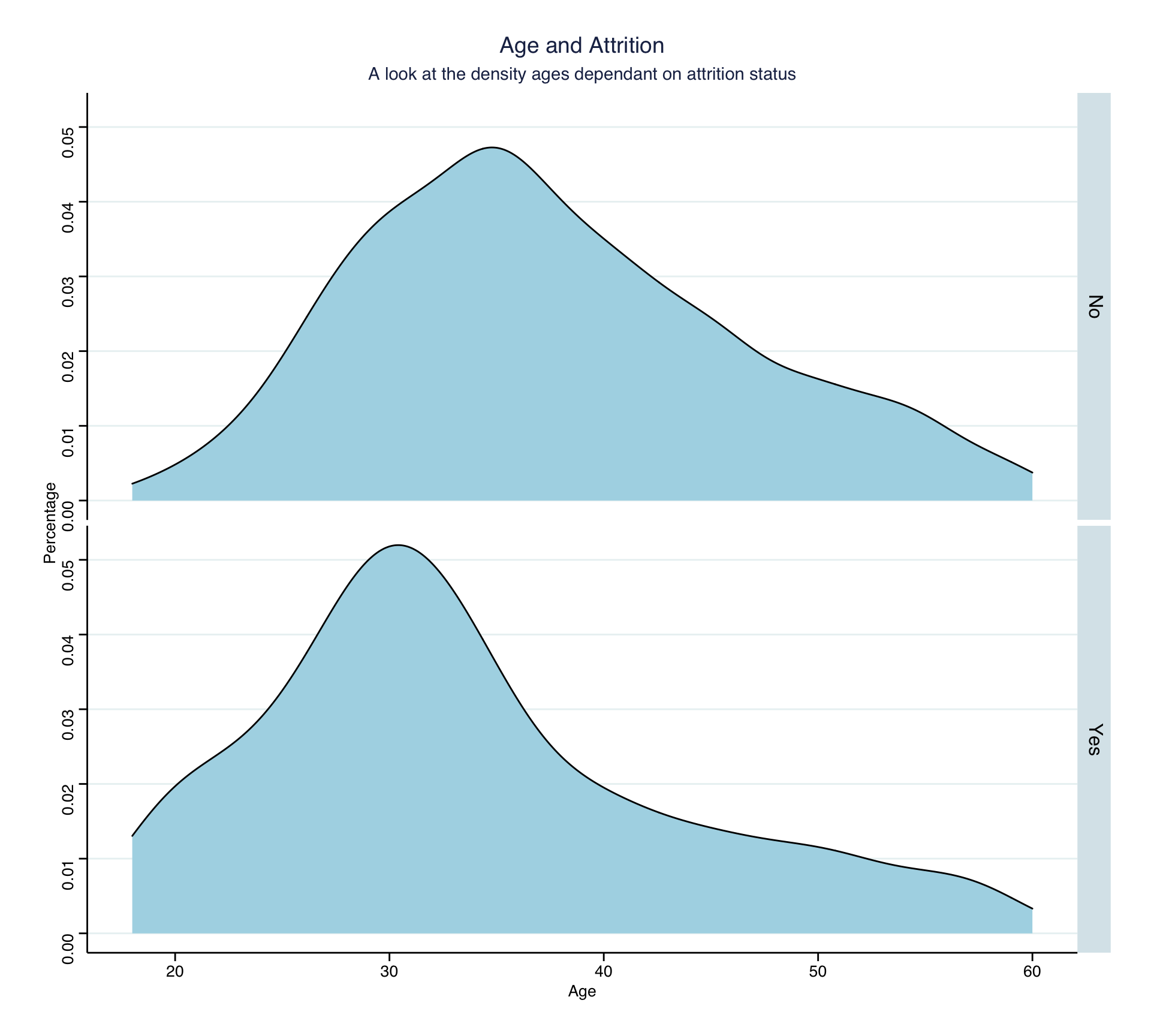
Looking at the two density plots, it is observable that values in the age variable tend to be lower for Attrition = Yes. One might speculate that younger employees tend to leave the company more often than older employees, because, on average, it is easier for them to find and adapt to a new job. Furthermore, as the analysis further below shows, compared to their older colleagues, they tend to have a lower salary, giving them less reason to stay with the company.
- How are
age,years_at_company,monthly_incomeandyears_since_last_promotiondistributed? can you roughly guess which of these variables is closer to Normal just by looking at summary statistics?
n<-length(hr_cleaned$age)

pic_data<-data.frame(cbind(c(hr_cleaned$age,hr_cleaned$monthly_income,
                  hr_cleaned$years_since_last_promotion),
                c(rep("age",n),rep("monthly_income",n),rep("years_since_last_promotion",n))))
colnames(pic_data)<-c("Num","Attribute")
pic_data$Num<-as.integer(pic_data$Num)

distribution<-ggplot(pic_data, aes(x=Num))+
  geom_histogram()+
  facet_wrap(vars(Attribute), scale="free")+
  labs(title = "Distribution across the dataset", subtitle = "Counts of values for age, monthly income and years since last promotion", x="",y="Frequency")+

  theme_bw()
distribution 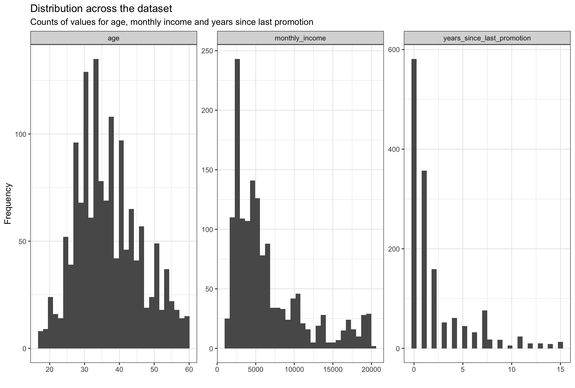
Looking at the three graphs, values for the age variable seem to be the most normally distributed, even though the distribution is skewed slightly to the right. This can be explained by the fact that the majority of the workforce lies in the age group 25-40. The remaining two graphs are skewed heavily to the right. The skewness of monthly income can be explained by the fact that most salaries tend to center around the mean, while there are large outliers on the higher side of income. Similarly, the distribution of years_since_last_promotion is in accordance with the frequency of employee promotion; people usually get promoted every 1-3 years.
- How are
job_satisfactionandwork_life_balancedistributed? Don’t just report counts, but express categories as % of total.
hr_satis <- hr_cleaned %>%
  group_by(job_satisfaction) %>%
  count(sort=TRUE) %>%
  rename(count=n)%>%
  mutate(percent=count/1470)%>%
  mutate(percent = percent(percent))


hr_satis
## # A tibble: 4 × 3
## # Groups: job_satisfaction [4]
## job_satisfaction count percent
## <chr> <int> <chr>
## 1 Very High 459 31%
## 2 High 442 30%
## 3 Low 289 20%
## 4 Medium 280 19%work_life_satis <- hr_cleaned %>%
group_by(work_life_balance) %>%
count(sort=TRUE) %>%
rename(count=n)%>%
mutate(percent=count/1470)%>%
mutate(percent = percent(percent))
work_life_satis ## # A tibble: 4 × 3
## # Groups: work_life_balance [4]
## work_life_balance count percent
## <chr> <int> <chr>
## 1 Better 893 61%
## 2 Good 344 23%
## 3 Best 153 10%
## 4 Bad 80 5%As for job satisfaction, 61% of employees reported that they are very highly or highly satisfied with their work while 19% of employees showed a low job satisfaction level. In general, job satisfaction levels seem to be evenly distributed throughout employees.
As for work-life balance,the majority (60%) of employees indicate that they have a better balance and only 5% think their work-life balance is bad.
- Is there any relationship between
monthly_incomeandeducation?monthly_incomeandgender?
plot1 <- ggplot(hr_cleaned, aes(x = fct_reorder(education, -monthly_income), y=monthly_income))+ #we include a negative "-" sign infront of monthly_income in the fct_reorder function, in order to sort the x axis based on decreasing y values
  geom_boxplot()+

  scale_y_continuous(labels = dollar)+

  labs(title = "Education vs income", subtitle = "A look at an employee's academic background and monthly income", x = "Education", y = "Monthly income")+

  theme_bw()
plot1 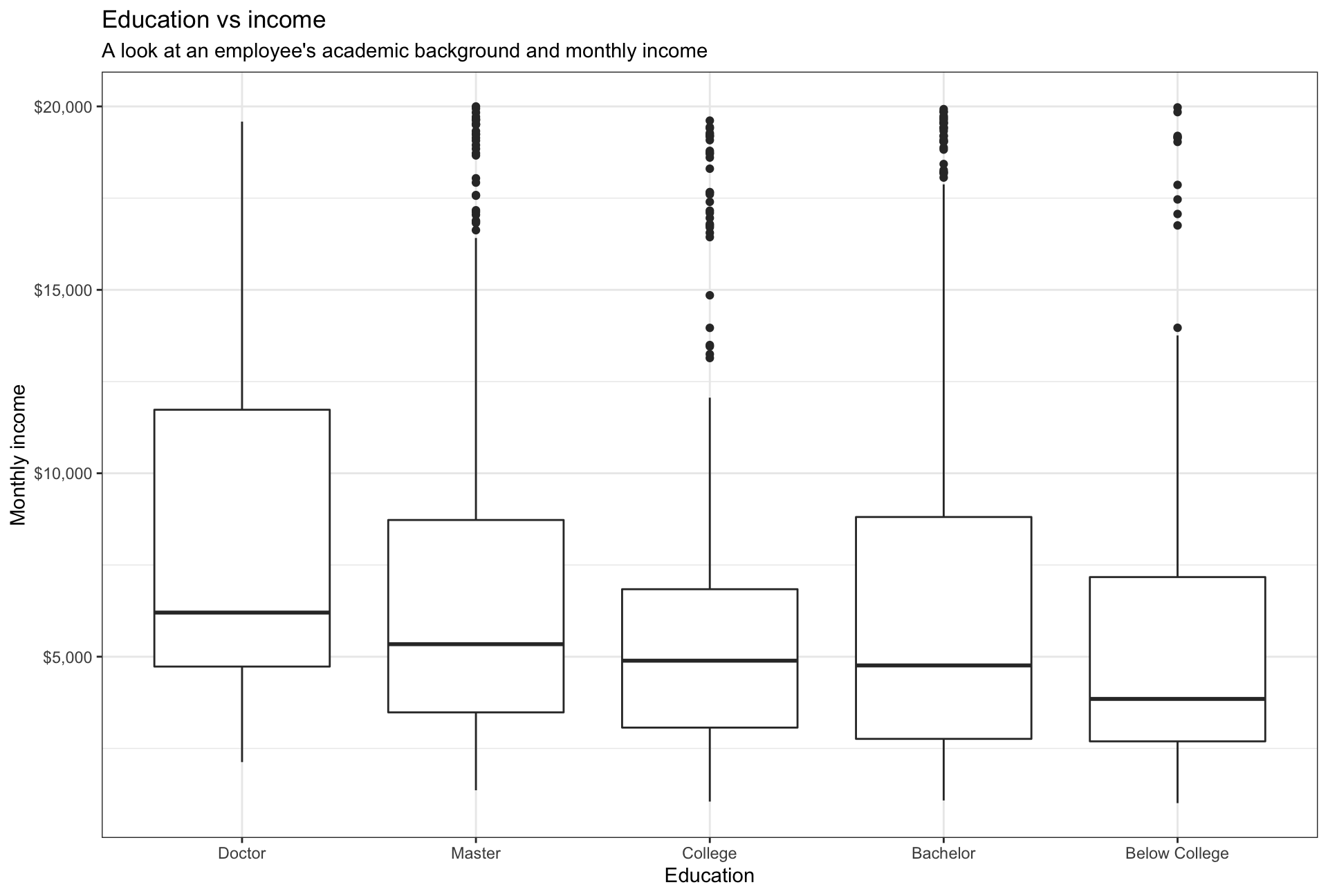
plot2 <-ggplot(hr_cleaned, aes(x = fct_reorder(gender, -monthly_income), y=monthly_income))+
  geom_boxplot()+

  scale_y_continuous(label = dollar)+

  labs(title = "Gender vs income", subtitle = "A look at an employee's sex and monthly income", x = "Gender", y = "Monthly income")+

  theme_bw()
plot2 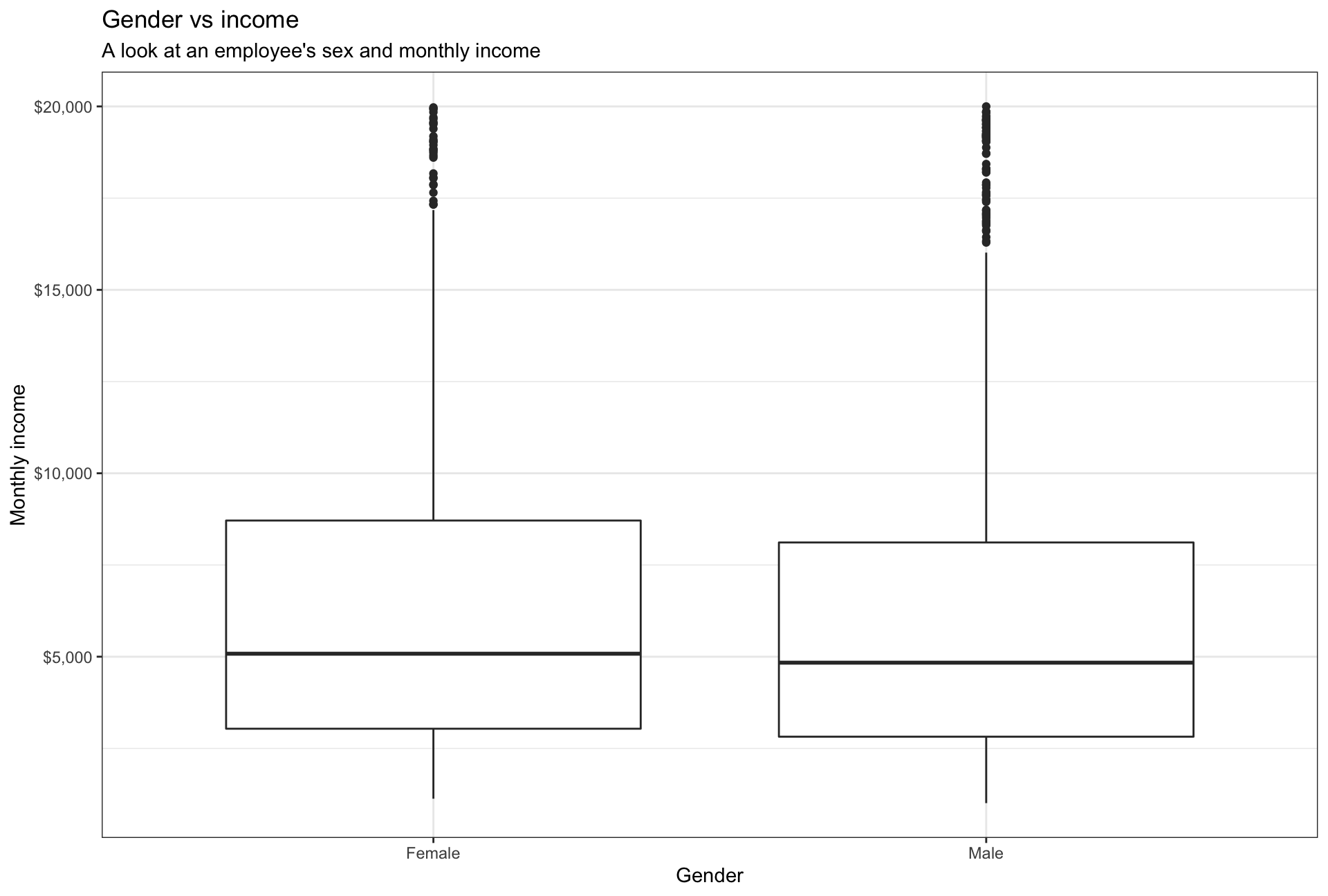
The average monthly income seems to be based on the level of education. We can infer from the box plot that higher the education level, the higher the monthly income. There also exist a couple of outliers within the dataset - as some masters students tend to be paid higher than others. This could be relative for specific schools / universities and exceptional candidates that are paid highly for particular roles.
Interestingly, salaries don’t differ across genders as may be expected.
- Plot a boxplot of income vs job role. Make sure the highest-paid job roles appear first
income_vs_job <- ggplot(hr_cleaned, aes(x=fct_reorder(job_role, -monthly_income), y=monthly_income)) +
  geom_boxplot()+

  scale_y_continuous(labels = dollar)+

  labs(title = "Income distribution by job", subtitle = "A look at the relationship between job titles and monthly income", x = "Job" , y="Monthly income")+

  theme(axis.text.x = element_text(angle = 90, vjust = 0.5)) #we adjust the labels on the x axis such that they are vertically aligned


income_vs_job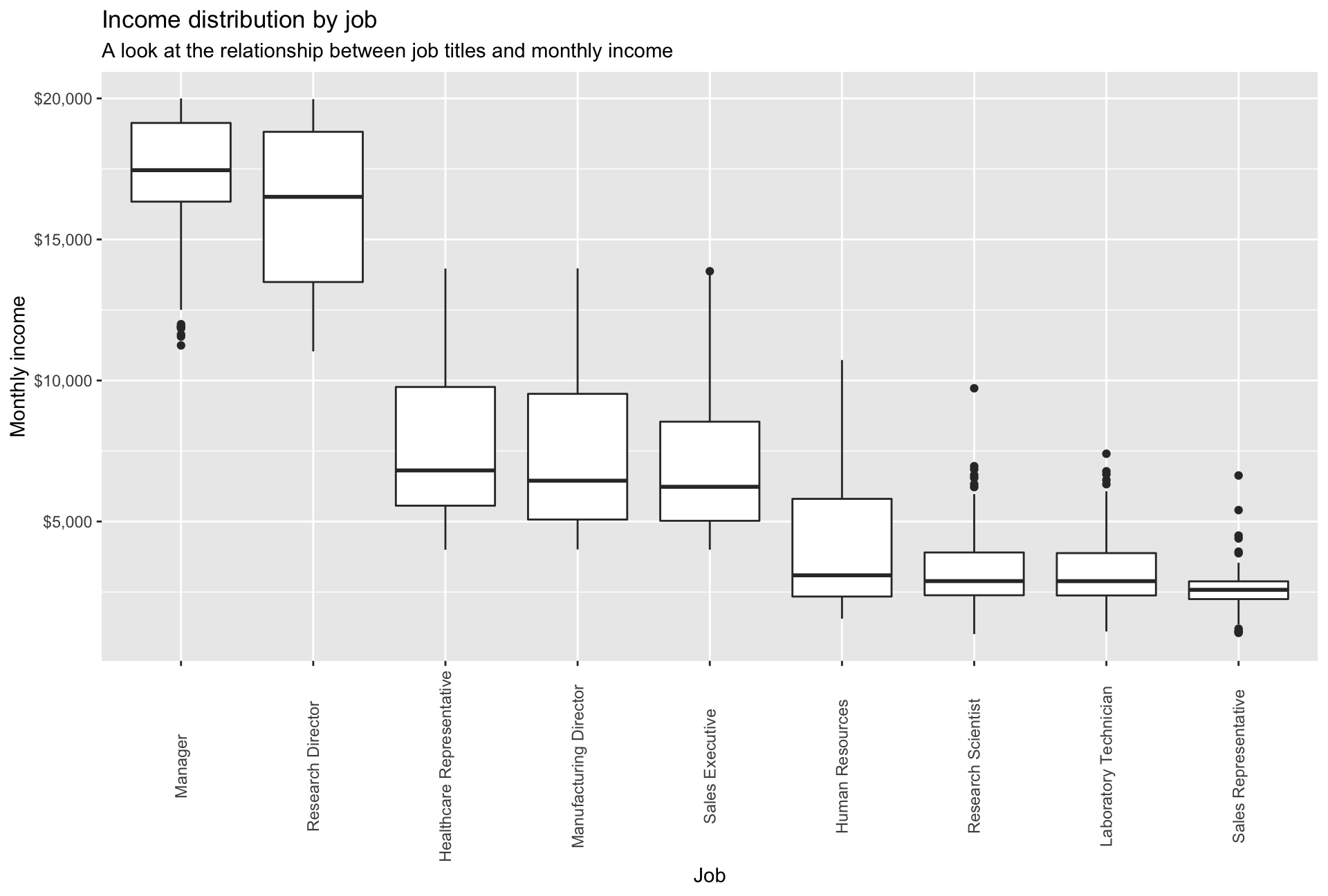
Across job roles, salaries differ significantly. For instance the monthly median salary for Managers is $17,500 while the one for Sales Representatives is just above $2,500. In addition, one can observe three salary groups: 1) around $2,700 2) around $7,000 and 3) around $17,000)
- Calculate and plot a bar chart of the mean (or median?) income by education level.
#We opted for plotting the MEDIAN monthly income, as it is typically less prone to outliers

median_income <- hr_cleaned%>%
  group_by(education)%>%
  summarise(median_monthly_income = median(monthly_income))%>%

  ggplot(aes(x = fct_reorder(education, -median_monthly_income), y = median_monthly_income))+
    geom_col(fill = "lightblue")+

    scale_y_continuous(labels = dollar)+

    labs(title = "Median income by education", subtitle = "A look at the relationship between academic background and median monthly income", x = "Education" , y="Median monthly income")+

    theme_bw()

median_income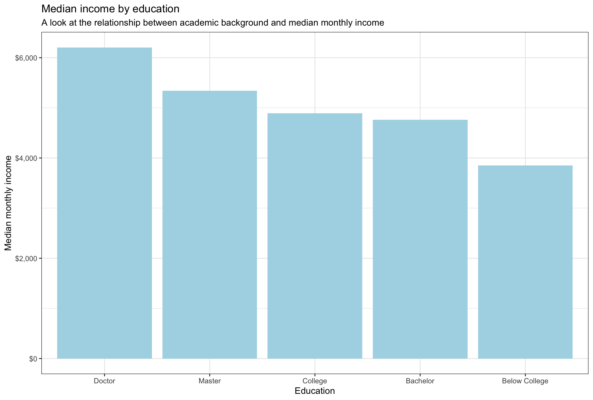
The median salaries across education levels are aligned with the distribution of the salaries. PhDs have the highest median salary while employees without a college degree have the lowest median salary. Interestingly, the median salary for College graduates is slightly higher than the one for Bachelor graduates, given that the higher qualification is a Bachelors degree.
- Plot the distribution of income by education level. Use a facet_wrap and a theme from
ggthemes
plot7 <- hr_cleaned %>%
  group_by(education) %>%
  ggplot(aes(x=monthly_income))+
    geom_histogram(fill = "lightblue")+
    facet_wrap(vars(education), scales = "free_y")+

    scale_x_continuous(labels = dollar)+

    labs(title = "Income distribution by education", subtitle = "A look at the relationship between edcuation level and monthly income", x = "Monthly income" , y="Count")+

    ggthemes::theme_stata()+
    theme(plot.background = element_blank()) #we remove the blue background to make the design more coherent
plot7 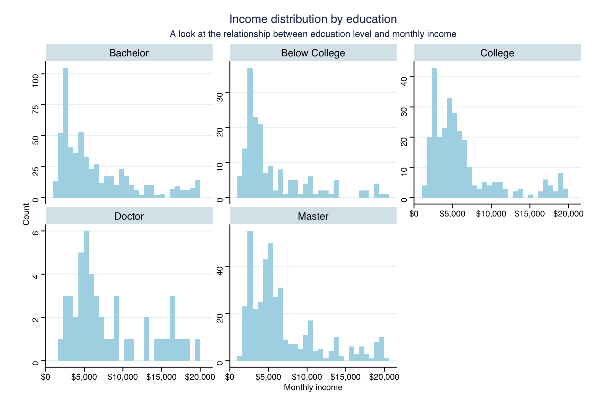
Even though the total number of employees differs heavily across the educational backgrounds, the overall distribution stays similar. One can observe a reduction in counts of employees for salaries between $12,000 and $17,000. The frequency of employees tends to increase at the higher end of monthly income levels.
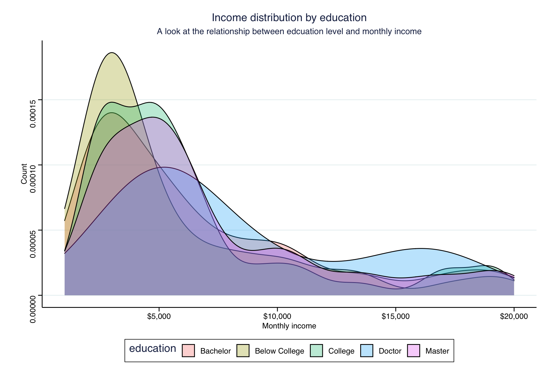
A similar picture is shown in the following density plot:
- Plot income vs age, faceted by
job_role
plot8 <- ggplot(hr_cleaned, aes(x=age, y=monthly_income))+
  geom_point(size=0.1)+
  geom_smooth(method = "lm")+
  facet_wrap(vars(job_role), scales = "free")+

  scale_y_continuous(labels = dollar)+

  labs(title = "Income by age and job title", subtitle = "A look at the relationship between age, job title and monthly income level", x = "Age" , y="Monthly income")+

  ggthemes::theme_stata()+
  theme(plot.background = element_blank())

plot8 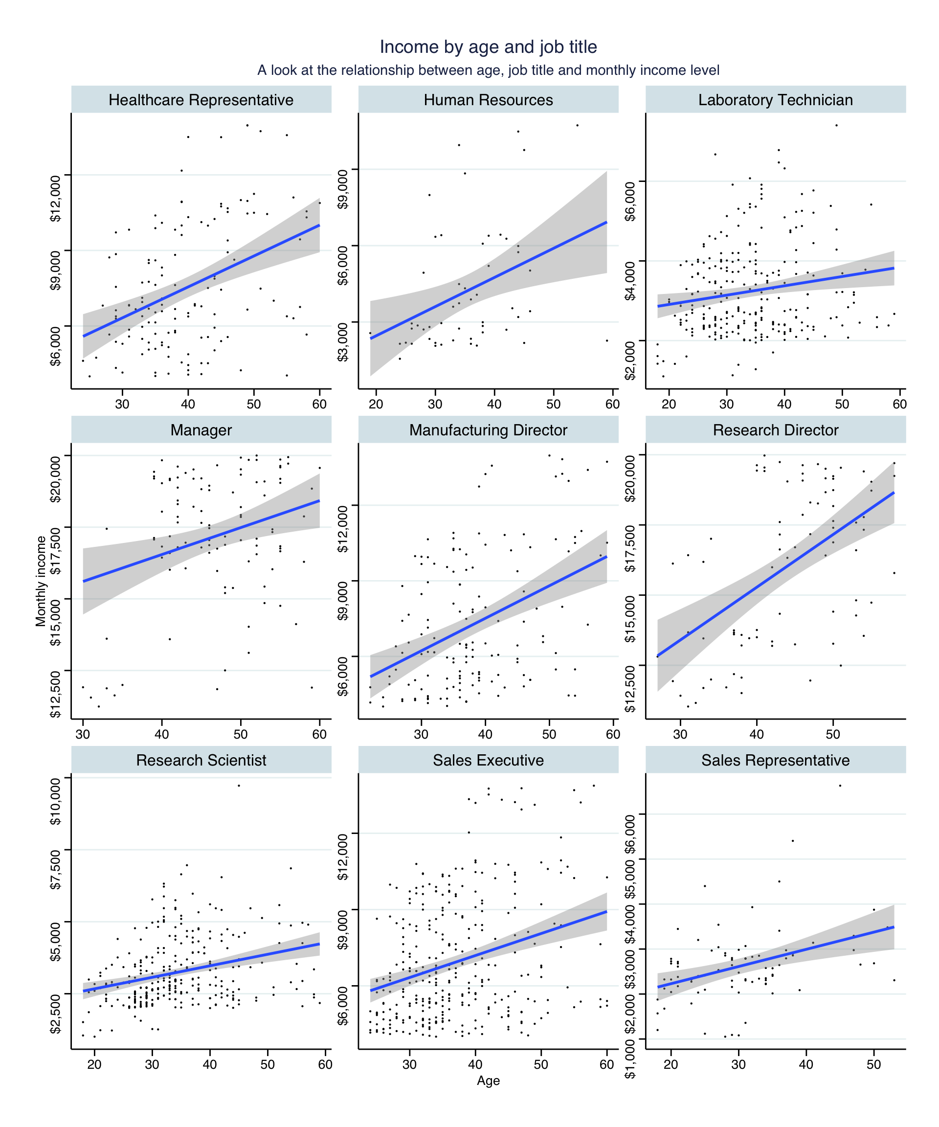
The positive relationship between age and income stays consistent across job titles, i.e. the higher the age, the higher the monthly income. The strength of relationship, however, varies. For instance, the increase in salaries for research directors is higher than for research scientists.