Pre-Programme Project MAM 2022

Author: Jiaying Chen
Task 1: gapminder country comparison
To get a glimpse of the dataframe, namely to see the variable names, variable types, etc., we use the glimpse function. We also want to have a look at the first 20 rows of data.
glimpse(gapminder)## Rows: 1,704
## Columns: 6
## $ country <fct> "Afghanistan", "Afghanistan", "Afghanistan", "Afghanistan", …
## $ continent <fct> Asia, Asia, Asia, Asia, Asia, Asia, Asia, Asia, Asia, Asia, …
## $ year <int> 1952, 1957, 1962, 1967, 1972, 1977, 1982, 1987, 1992, 1997, …
## $ lifeExp <dbl> 28.801, 30.332, 31.997, 34.020, 36.088, 38.438, 39.854, 40.8…
## $ pop <int> 8425333, 9240934, 10267083, 11537966, 13079460, 14880372, 12…
## $ gdpPercap <dbl> 779.4453, 820.8530, 853.1007, 836.1971, 739.9811, 786.1134, …head(gapminder, 20) # look at the first 20 rows of the dataframe## # A tibble: 20 × 6
## country continent year lifeExp pop gdpPercap
## <fct> <fct> <int> <dbl> <int> <dbl>
## 1 Afghanistan Asia 1952 28.8 8425333 779.
## 2 Afghanistan Asia 1957 30.3 9240934 821.
## 3 Afghanistan Asia 1962 32.0 10267083 853.
## 4 Afghanistan Asia 1967 34.0 11537966 836.
## 5 Afghanistan Asia 1972 36.1 13079460 740.
## 6 Afghanistan Asia 1977 38.4 14880372 786.
## 7 Afghanistan Asia 1982 39.9 12881816 978.
## 8 Afghanistan Asia 1987 40.8 13867957 852.
## 9 Afghanistan Asia 1992 41.7 16317921 649.
## 10 Afghanistan Asia 1997 41.8 22227415 635.
## 11 Afghanistan Asia 2002 42.1 25268405 727.
## 12 Afghanistan Asia 2007 43.8 31889923 975.
## 13 Albania Europe 1952 55.2 1282697 1601.
## 14 Albania Europe 1957 59.3 1476505 1942.
## 15 Albania Europe 1962 64.8 1728137 2313.
## 16 Albania Europe 1967 66.2 1984060 2760.
## 17 Albania Europe 1972 67.7 2263554 3313.
## 18 Albania Europe 1977 68.9 2509048 3533.
## 19 Albania Europe 1982 70.4 2780097 3631.
## 20 Albania Europe 1987 72 3075321 3739.country_data <- gapminder %>%
filter(country == "China") # just choosing Greece, as this is where I come from
continent_data <- gapminder %>%
filter(continent == "Asia")First, create a plot of life expectancy over time for the single country you chose.
plot1 <- ggplot(data = country_data, mapping = aes(x = year, y = lifeExp))+
    geom_point() +
    geom_smooth(se = FALSE)+
    NULL

plot1
## `geom_smooth()` using method = 'loess' and formula 'y ~ x'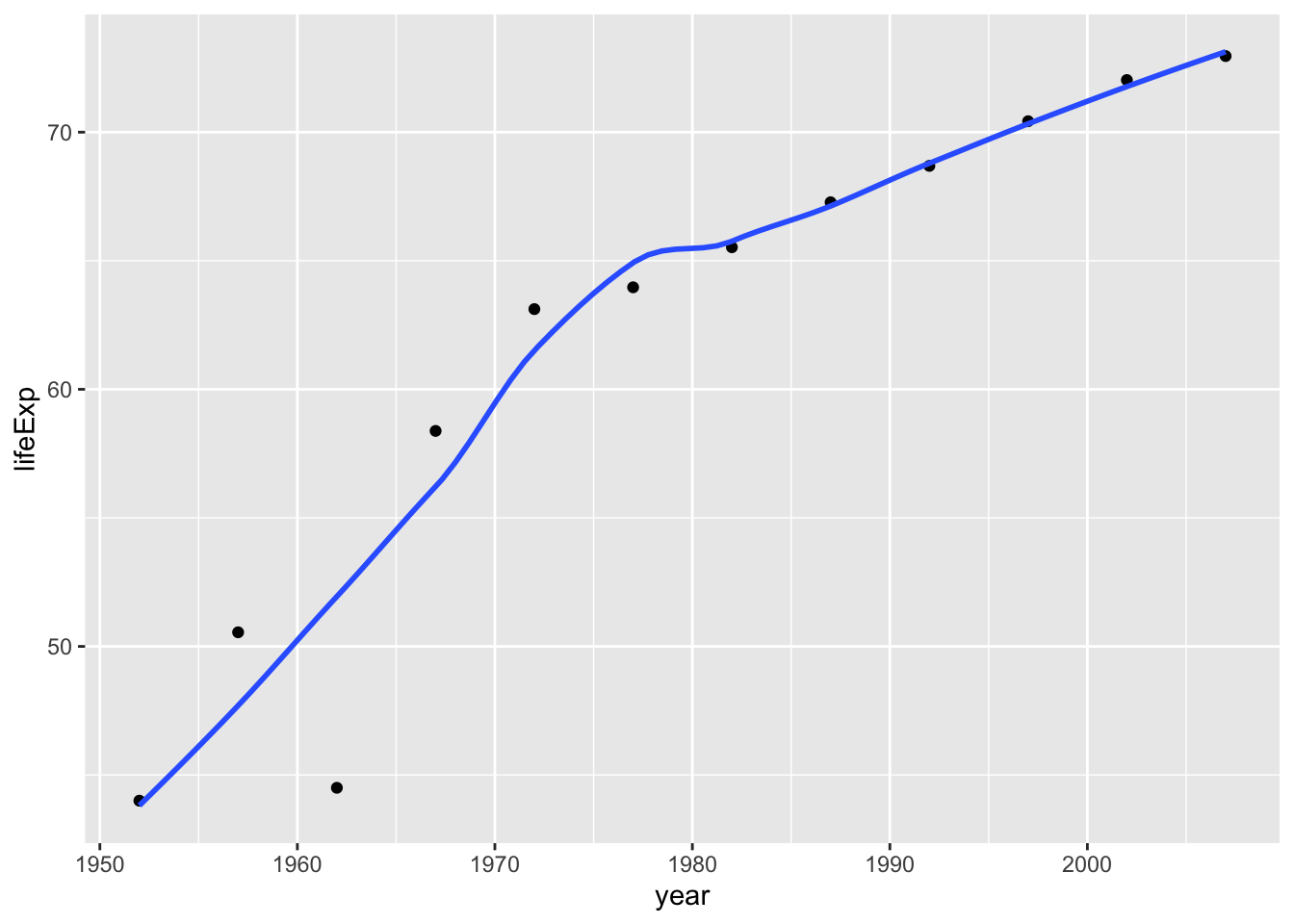
Next we need to add a title. Create a new plot, or extend plot1, using the labs() function to add an informative title to the plot.
 plot1<- plot1 +
   labs(title = "Life expectancy over time in China  ",
       x = "Year ",
       y = "Life Expectancy ") +
   NULL


 plot1
## `geom_smooth()` using method = 'loess' and formula 'y ~ x'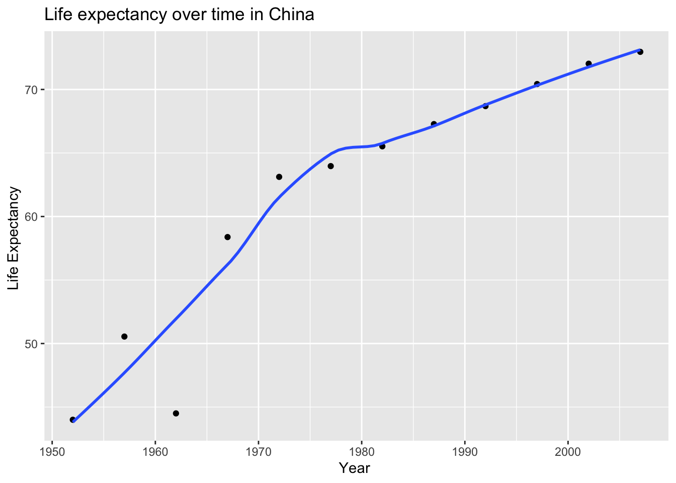
Secondly, produce a plot for all countries in the continent you come from.
 ggplot(continent_data, mapping = aes(x = year  , y = lifeExp , colour= country , group = country))+
   geom_point() +
   geom_smooth(se = FALSE) +
   NULL
## `geom_smooth()` using method = 'loess' and formula 'y ~ x'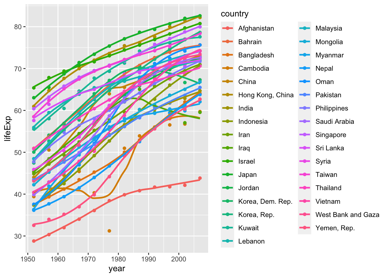
Finally, using the original gapminder data, produce a life expectancy over time graph, grouped (or faceted) by continent.
 ggplot(data = gapminder , mapping = aes(x = year , y = lifeExp , colour= country))+
   geom_point() +
   geom_smooth(se = FALSE) +
   facet_wrap(~continent) +
   theme(legend.position="none") + #remove all legends
   NULL
## `geom_smooth()` using method = 'loess' and formula 'y ~ x'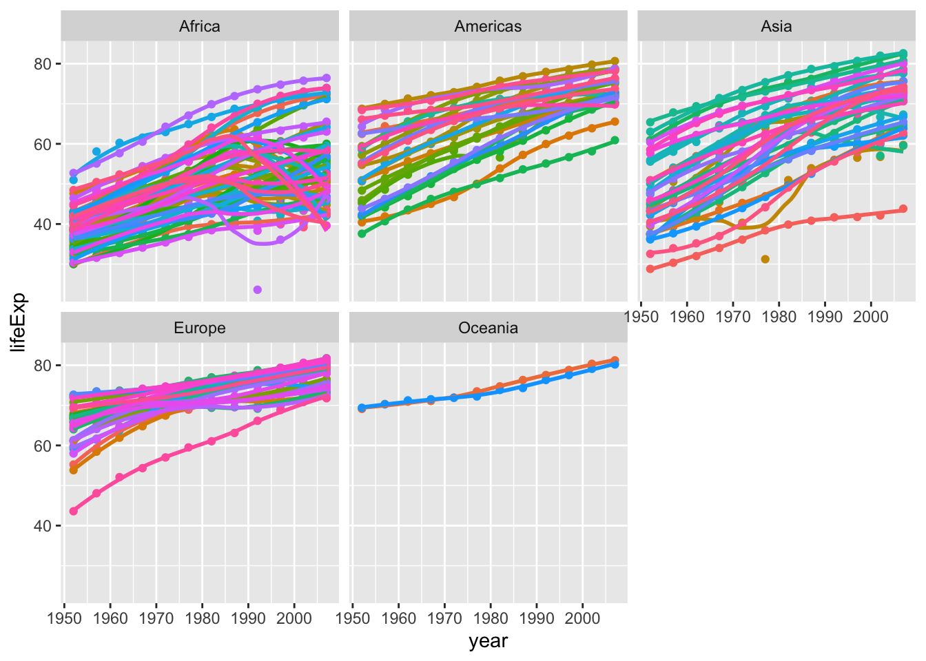
Given these trends, what can you say about life expectancy since 1952?
- As for China, the life expectancy since 1952 has showed a rapid increase from below 45 to over 70. The growth rate is smaller after 1975.And I observed that the life expectancy decreased in 1962 compared to 1957, which is against the trend. This is probably result from the famine in the 1960s in China.
- As for Asia,life expectancy varies greatly from country to country. Japan has the highest life expectancy which is over 80 now while Yeman has the lowest which is around 44 now. Most countries has risen rapidly since 1952 but Iraq showed a different trend because of war.
- As for the difference between continent, Europe, Americas and Oceania show a milder growth compared with Asia and Africa, which indicates the rapid development in quality of life in developing countries and areas in the past 70 years. The other point is that there are many countries in Africa that have experienced retrogression in life expectancy, which indicates these countries faced serious economic challenges.
Task 2: Brexit vote analysis
We will have a look at the results of the 2016 Brexit vote in the UK. First we read the data using read_csv() and have a quick glimpse at the data
brexit_results <- read_csv(here::here("data","brexit_results.csv"))


glimpse(brexit_results)
## Rows: 632
## Columns: 11
## $ Seat <chr> "Aldershot", "Aldridge-Brownhills", "Altrincham and Sale W…
## $ con_2015 <dbl> 50.592, 52.050, 52.994, 43.979, 60.788, 22.418, 52.454, 22…
## $ lab_2015 <dbl> 18.333, 22.369, 26.686, 34.781, 11.197, 41.022, 18.441, 49…
## $ ld_2015 <dbl> 8.824, 3.367, 8.383, 2.975, 7.192, 14.828, 5.984, 2.423, 1…
## $ ukip_2015 <dbl> 17.867, 19.624, 8.011, 15.887, 14.438, 21.409, 18.821, 21.…
## $ leave_share <dbl> 57.89777, 67.79635, 38.58780, 65.29912, 49.70111, 70.47289…
## $ born_in_uk <dbl> 83.10464, 96.12207, 90.48566, 97.30437, 93.33793, 96.96214…
## $ male <dbl> 49.89896, 48.92951, 48.90621, 49.21657, 48.00189, 49.17185…
## $ unemployed <dbl> 3.637000, 4.553607, 3.039963, 4.261173, 2.468100, 4.742731…
## $ degree <dbl> 13.870661, 9.974114, 28.600135, 9.336294, 18.775591, 6.085…
## $ age_18to24 <dbl> 9.406093, 7.325850, 6.437453, 7.747801, 5.734730, 8.209863…The data comes from Elliott Morris, who cleaned it and made it available through his DataCamp class on analysing election and polling data in R.
Our main outcome variable (or y) is leave_share, which is the percent of votes cast in favour of Brexit, or leaving the EU. Each row is a UK parliament constituency.
To get a sense of the spread, or distribution, of the data, we can plot a histogram, a density plot, and the empirical cumulative distribution function of the leave % in all constituencies.
# histogram
h1 <-ggplot(brexit_results, aes(x = leave_share)) +
  geom_histogram(binwidth = 2.5)
h1+labs(title='The histogram of Percentage of votes that in favour of Brexit in all constituencies ',subtitle='histogram',x='The percentage that in favour of Brexit',y='The number of constituencies')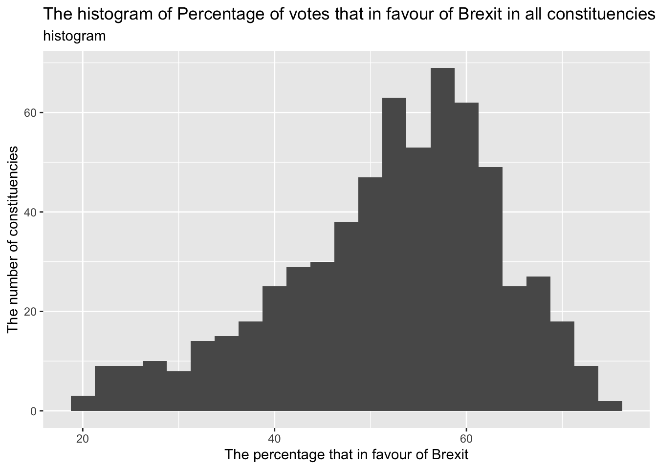
# density plot-- think smoothed histogram
d1<-ggplot(brexit_results, aes(x = leave_share)) +
  geom_density()
d1+labs(title='Distribution of Percentage of votes that in favour of Brexit in all constituencies ',subtitle='Density plot',x='the percentage that in favour of Brexit',y='density')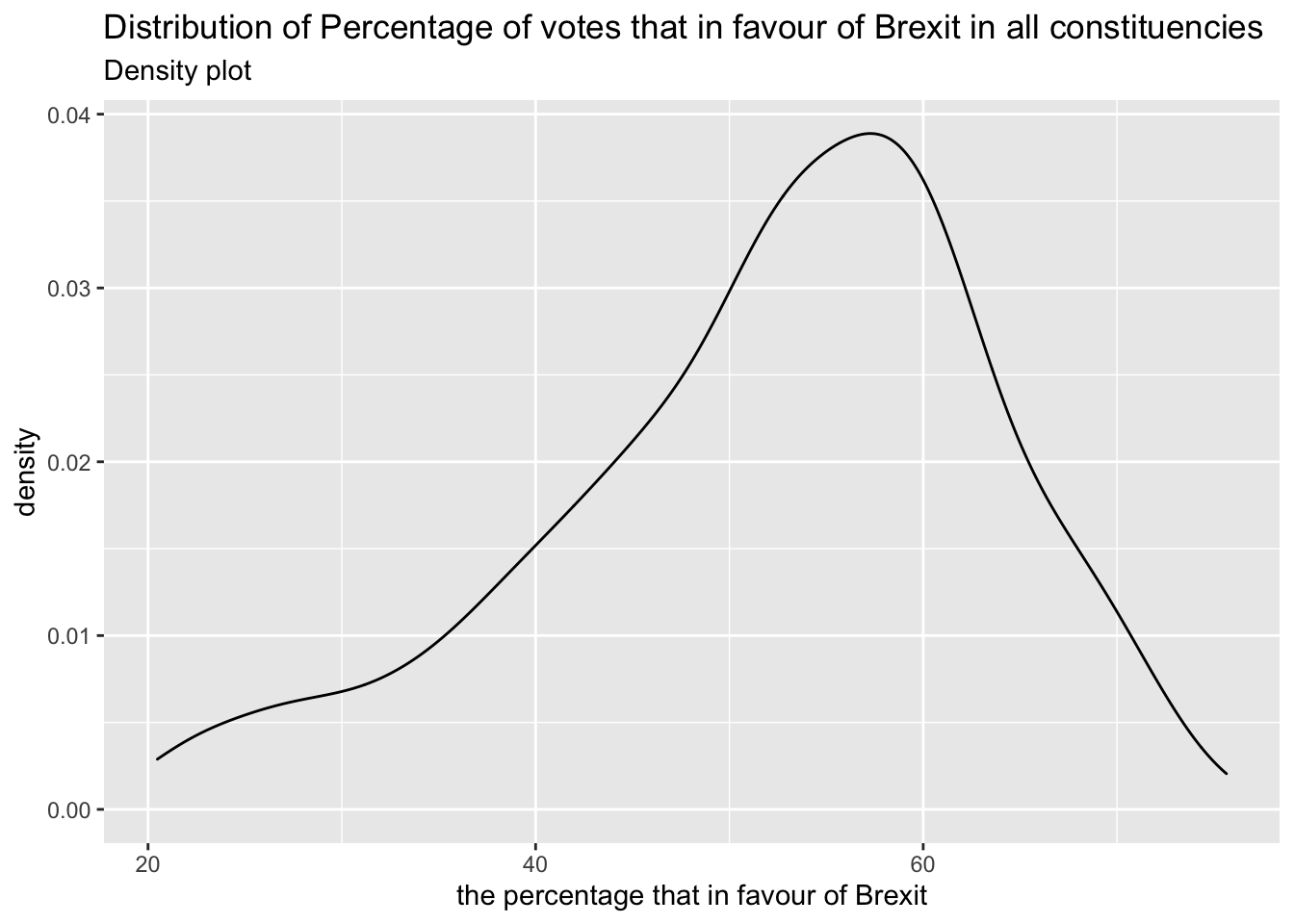
# The empirical cumulative distribution function (ECDF)
c1<-ggplot(brexit_results, aes(x = leave_share)) +
  stat_ecdf(geom = "step", pad = FALSE) +
  scale_y_continuous(labels = scales::percent)
c1+labs(title='The empirical cumulative distribution of Percentage of votes that in favour of Brexit in all constituencies ',subtitle='ECDF',x='the percentage that in favour of Brexit',y='probability')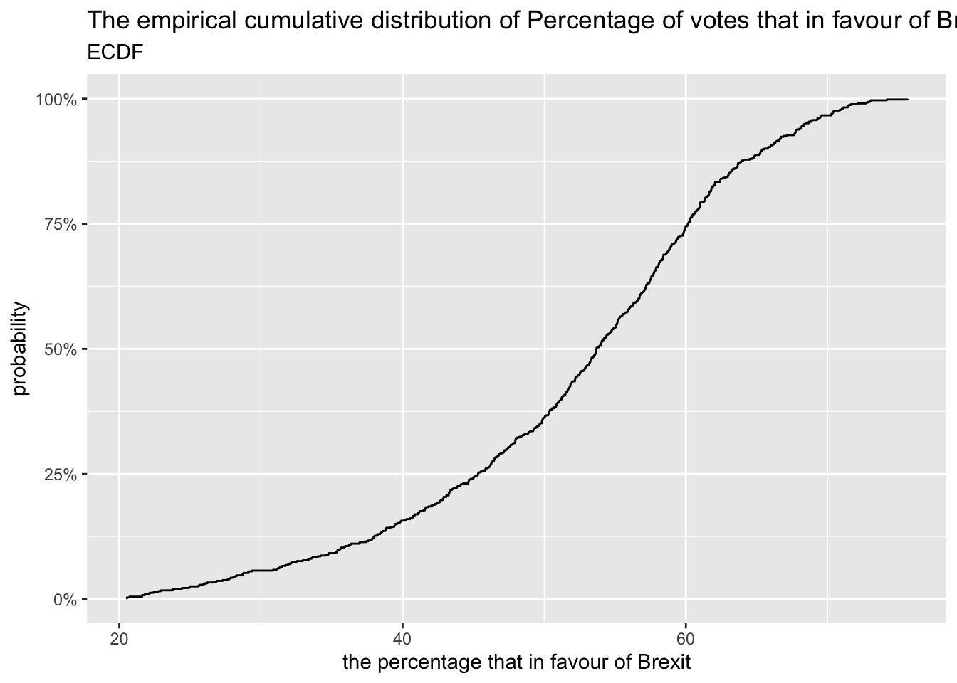
One common explanation for the Brexit outcome was fear of immigration and opposition to the EU’s more open border policy. We can check the relationship (or correlation) between the proportion of native born residents (born_in_uk) in a constituency and its leave_share. To do this, let us get the correlation between the two variables
brexit_results %>%
  select(leave_share, born_in_uk) %>%
  cor()
## leave_share born_in_uk
## leave_share 1.0000000 0.4934295
## born_in_uk 0.4934295 1.0000000r1<-ggplot(brexit_results, aes(x = born_in_uk, y = leave_share)) +
geom_point(alpha=0.3) +
# add a smoothing line, and use method="lm" to get the best straight-line
geom_smooth(method = "lm") +
# use a white background and frame the plot with a black box
theme_bw() +
NULL
r1+labs(title='The scatterplot of the proportion of native born residents and the tendency to vote for Brexit ',subtitle = 'scatterplot',x='the proportion of native born residents',y='the percetage of vote for Brexit')## `geom_smooth()` using formula 'y ~ x'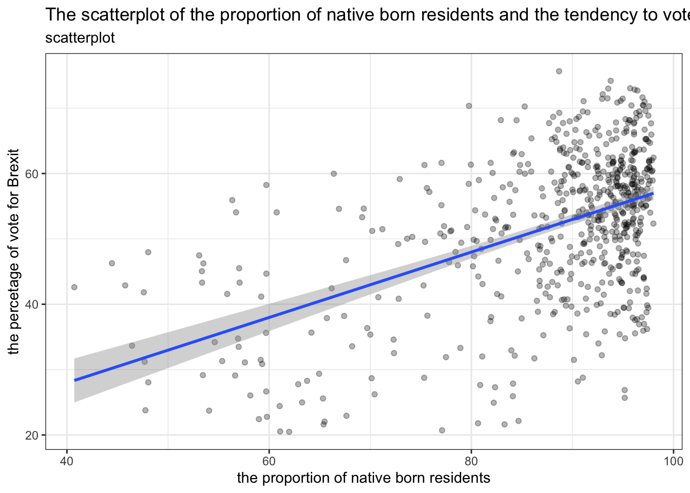 According to the scatterplot and the correlation which is 0.49, we can conclude that the proportion of native born residents in a constituency and its percentage of vote in favour of Brexit is positively related. In other words, the fear of immigration has some kind of influence on the result of Brexit. But correlation is not equal to causality. Thus, we can’t come to conclusion that Brexit outcome result from fear of immigration and opposition to the EU’s more open border policy. We still need more proof to examine this argument.*
Task 3: Animal rescue incidents attended by the London Fire Brigade
The London Fire Brigade attends a range of non-fire incidents (which we call ‘special services’). These ‘special services’ include assistance to animals that may be trapped or in distress. The data is provided from January 2009 and is updated monthly. A range of information is supplied for each incident including some location information (postcode, borough, ward), as well as the data/time of the incidents. We do not routinely record data about animal deaths or injuries.
Please note that any cost included is a notional cost calculated based on the length of time rounded up to the nearest hour spent by Pump, Aerial and FRU appliances at the incident and charged at the current Brigade hourly rate.
url <- "https://data.london.gov.uk/download/animal-rescue-incidents-attended-by-lfb/8a7d91c2-9aec-4bde-937a-3998f4717cd8/Animal%20Rescue%20incidents%20attended%20by%20LFB%20from%20Jan%202009.csv"

animal_rescue <- read_csv(url,
                          locale = locale(encoding = "CP1252")) %>%
  janitor::clean_names()


glimpse(animal_rescue)
## Rows: 7,873
## Columns: 31
## $ incident_number <chr> "139091", "275091", "2075091", "2872091"…
## $ date_time_of_call <chr> "01/01/2009 03:01", "01/01/2009 08:51", …
## $ cal_year <dbl> 2009, 2009, 2009, 2009, 2009, 2009, 2009…
## $ fin_year <chr> "2008/09", "2008/09", "2008/09", "2008/0…
## $ type_of_incident <chr> "Special Service", "Special Service", "S…
## $ pump_count <chr> "1", "1", "1", "1", "1", "1", "1", "1", …
## $ pump_hours_total <chr> "2", "1", "1", "1", "1", "1", "1", "1", …
## $ hourly_notional_cost <dbl> 255, 255, 255, 255, 255, 255, 255, 255, …
## $ incident_notional_cost <chr> "510", "255", "255", "255", "255", "255"…
## $ final_description <chr> "Redacted", "Redacted", "Redacted", "Red…
## $ animal_group_parent <chr> "Dog", "Fox", "Dog", "Horse", "Rabbit", …
## $ originof_call <chr> "Person (land line)", "Person (land line…
## $ property_type <chr> "House - single occupancy", "Railings", …
## $ property_category <chr> "Dwelling", "Outdoor Structure", "Outdoo…
## $ special_service_type_category <chr> "Other animal assistance", "Other animal…
## $ special_service_type <chr> "Animal assistance involving livestock -…
## $ ward_code <chr> "E05011467", "E05000169", "E05000558", "…
## $ ward <chr> "Crystal Palace & Upper Norwood", "Woods…
## $ borough_code <chr> "E09000008", "E09000008", "E09000029", "…
## $ borough <chr> "Croydon", "Croydon", "Sutton", "Hilling…
## $ stn_ground_name <chr> "Norbury", "Woodside", "Wallington", "Ru…
## $ uprn <chr> "NULL", "NULL", "NULL", "100021491149.00…
## $ street <chr> "Waddington Way", "Grasmere Road", "Mill…
## $ usrn <chr> "20500146.00", "NULL", "NULL", "21401484…
## $ postcode_district <chr> "SE19", "SE25", "SM5", "UB9", "RM3", "RM…
## $ easting_m <chr> "NULL", "534785", "528041", "504689", "N…
## $ northing_m <chr> "NULL", "167546", "164923", "190685", "N…
## $ easting_rounded <dbl> 532350, 534750, 528050, 504650, 554650, …
## $ northing_rounded <dbl> 170050, 167550, 164950, 190650, 192350, …
## $ latitude <chr> "NULL", "51.39095371", "51.36894086", "5…
## $ longitude <chr> "NULL", "-0.064166887", "-0.161985191", …animal_rescue %>%
dplyr::group_by(cal_year) %>%
summarise(count=n())## # A tibble: 13 × 2
## cal_year count
## <dbl> <int>
## 1 2009 568
## 2 2010 611
## 3 2011 620
## 4 2012 603
## 5 2013 585
## 6 2014 583
## 7 2015 540
## 8 2016 604
## 9 2017 539
## 10 2018 610
## 11 2019 604
## 12 2020 758
## 13 2021 648animal_rescue %>%
count(cal_year, name="count")## # A tibble: 13 × 2
## cal_year count
## <dbl> <int>
## 1 2009 568
## 2 2010 611
## 3 2011 620
## 4 2012 603
## 5 2013 585
## 6 2014 583
## 7 2015 540
## 8 2016 604
## 9 2017 539
## 10 2018 610
## 11 2019 604
## 12 2020 758
## 13 2021 648Let us try to see how many incidents we have by animal group.
animal_rescue %>%
  group_by(animal_group_parent) %>%

  #group_by and summarise will produce a new column with the count in each animal group
  summarise(count = n()) %>%

  # mutate adds a new column; here we calculate the percentage
  mutate(percent = round(100*count/sum(count),2)) %>%

  # arrange() sorts the data by percent. Since the default sorting is min to max and we would like to see it sorted
  # in descending order (max to min), we use arrange(desc())
  arrange(desc(percent))
## # A tibble: 28 × 3
## animal_group_parent count percent
## <chr> <int> <dbl>
## 1 Cat 3783 48.0
## 2 Bird 1631 20.7
## 3 Dog 1230 15.6
## 4 Fox 373 4.74
## 5 Unknown - Domestic Animal Or Pet 201 2.55
## 6 Horse 195 2.48
## 7 Deer 136 1.73
## 8 Unknown - Wild Animal 94 1.19
## 9 Squirrel 68 0.86
## 10 Unknown - Heavy Livestock Animal 50 0.64
## # … with 18 more rowsanimal_rescue %>%
#count does the same thing as group_by and summarise
# name = "count" will call the column with the counts "count" ( exciting, I know)
# and 'sort=TRUE' will sort them from max to min
count(animal_group_parent, name="count", sort=TRUE) %>%
mutate(percent = round(100*count/sum(count),2))## # A tibble: 28 × 3
## animal_group_parent count percent
## <chr> <int> <dbl>
## 1 Cat 3783 48.0
## 2 Bird 1631 20.7
## 3 Dog 1230 15.6
## 4 Fox 373 4.74
## 5 Unknown - Domestic Animal Or Pet 201 2.55
## 6 Horse 195 2.48
## 7 Deer 136 1.73
## 8 Unknown - Wild Animal 94 1.19
## 9 Squirrel 68 0.86
## 10 Unknown - Heavy Livestock Animal 50 0.64
## # … with 18 more rows#There are two animal groups both named cats.They should be comined together.Finally, let us have a look at the notional cost for rescuing each of these animals. As the LFB says,
Please note that any cost included is a notional cost calculated based on the length of time rounded up to the nearest hour spent by Pump, Aerial and FRU appliances at the incident and charged at the current Brigade hourly rate.
There is two things we will do:
- Calculate the mean and median
incident_notional_costfor eachanimal_group_parent - Plot a boxplot to get a feel for the distribution of
incident_notional_costbyanimal_group_parent.
# what type is variable incident_notional_cost from dataframe `animal_rescue`
typeof(animal_rescue$incident_notional_cost)
## [1] "character"# readr::parse_number() will convert any numerical values stored as characters into numbers
animal_rescue <- animal_rescue %>%
# we use mutate() to use the parse_number() function and overwrite the same variable
mutate(incident_notional_cost = parse_number(incident_notional_cost))
# incident_notional_cost from dataframe `animal_rescue` is now 'double' or numeric
typeof(animal_rescue$incident_notional_cost)## [1] "double"Now tht incident_notional_cost is numeric, let us quickly calculate summary statistics for each animal group.
animal_rescue %>%

  # group by animal_group_parent
  group_by(animal_group_parent) %>%

  # filter resulting data, so each group has at least 6 observations
  filter(n()>6) %>%

  # summarise() will collapse all values into 3 values: the mean, median, and count
  # we use na.rm=TRUE to make sure we remove any NAs, or cases where we do not have the incident cos
  summarise(mean_incident_cost = mean (incident_notional_cost, na.rm=TRUE),
            median_incident_cost = median (incident_notional_cost, na.rm=TRUE),
            sd_incident_cost = sd (incident_notional_cost, na.rm=TRUE),
            min_incident_cost = min (incident_notional_cost, na.rm=TRUE),
            max_incident_cost = max (incident_notional_cost, na.rm=TRUE),
            count = n()) %>%

  # sort the resulting data in descending order. You choose whether to sort by count or mean cost.
  arrange(desc(mean_incident_cost))
## # A tibble: 16 × 7
## animal_group_parent mean_incident_co… median_incident_… sd_incident_cost
## <chr> <dbl> <dbl> <dbl>
## 1 Horse 740. 596 541.
## 2 Cow 599. 436 451.
## 3 Unknown - Wild Animal 416. 333 322.
## 4 Deer 415. 333 282.
## 5 Unknown - Heavy Livesto… 374. 260 263.
## 6 Fox 374. 328 205.
## 7 Snake 356. 339 105.
## 8 Dog 347. 298 168.
## 9 Bird 344. 328 134.
## 10 Cat 344. 326 160.
## 11 Unknown - Domestic Anim… 326. 295 116.
## 12 cat 324. 290 94.1
## 13 Hamster 315. 290 95.0
## 14 Squirrel 314. 326 56.7
## 15 Ferret 309. 333 39.4
## 16 Rabbit 309. 326 32.2
## # … with 3 more variables: min_incident_cost <dbl>, max_incident_cost <dbl>,
## # count <int>Except for squirrel,ferret and rabbit, median incident costs are much lower than the mean incident costs. This indicates that the distribution of the incident costs is generally positively skewed. The minimum of incident cost of dogs is zero while it is 255 or 260 in other animals’ group. So this is an outlier.
Finally, let us plot a few plots that show the distribution of incident_cost for each animal group.
# base_plot
base_plot <- animal_rescue %>%
  group_by(animal_group_parent) %>%
  filter(n()>6) %>%
  ggplot(aes(x=incident_notional_cost))+
  facet_wrap(~animal_group_parent, scales = "free")+
  theme_bw()

base_plot + geom_histogram()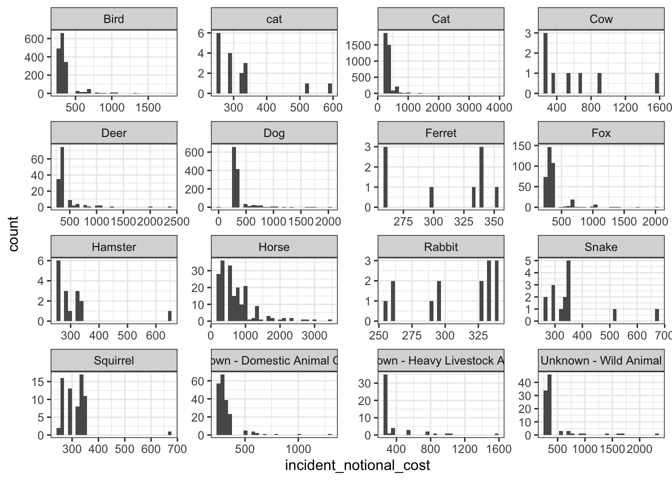
base_plot + geom_density()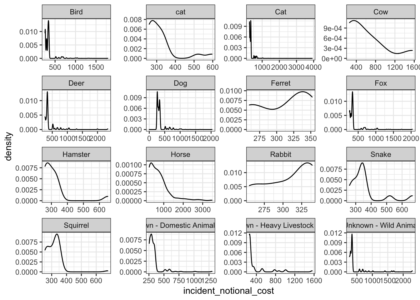
base_plot + geom_boxplot()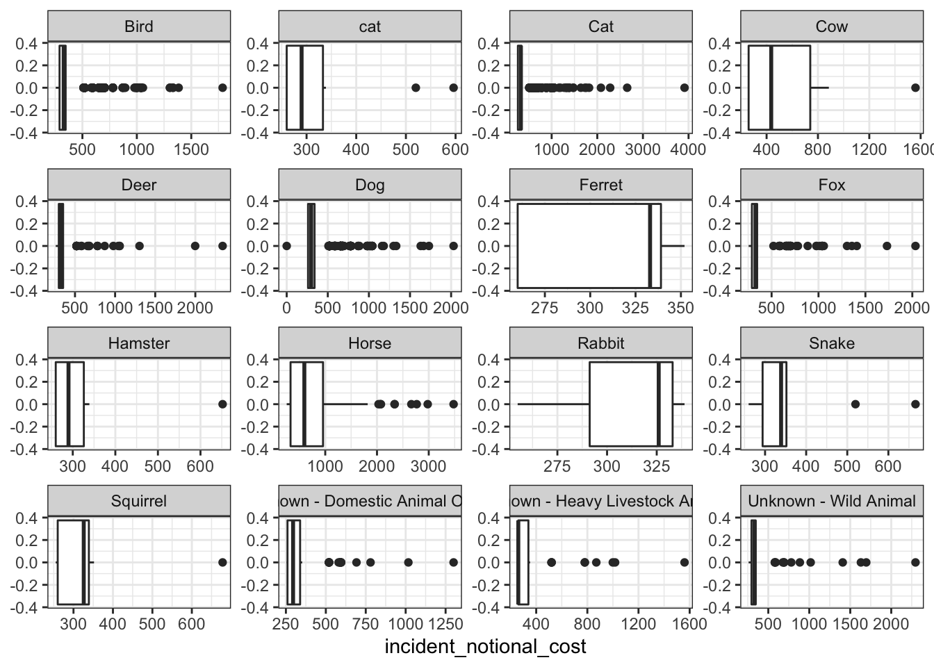
base_plot + stat_ecdf(geom = "step", pad = FALSE) +
  scale_y_continuous(labels = scales::percent)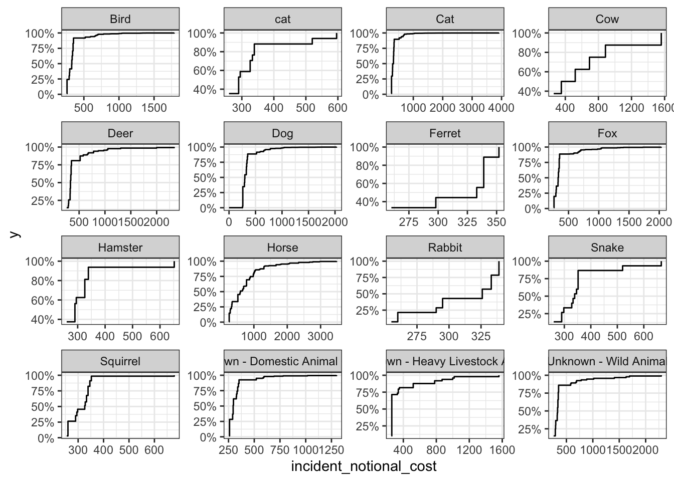
- I think the boxplot best communicates the variability of the incident cost of different animal groups.
- The graph shows that horses are the most expensive to rescue, with a range between 250-1000. This indicates that the time rounded up to the nearest hour spent by Pump, Aerial and FRU appliances at the incident of horse are the longest generally.
- Based on median incident cost, the cheapest to rescue is heavy livestock animals.
- Cats are the most common animal to rescue with over three thousand incidents while cows are the least common animal to rescue with only eight incidents.